
Measure of Justice: Covering the Cerîde-i Adliye Covers
Bu yazıyı Türkçe okumak için tıklayın.
The research exhibition “Speak to the Eyes: Visualizing Information from the Ottoman Era to the Republic” curated by Ömer Durmaz studies information visualization with a specific focus on the Late Ottoman and the Early Turkish Republic periods while also taking into account the history of informational design in the West.
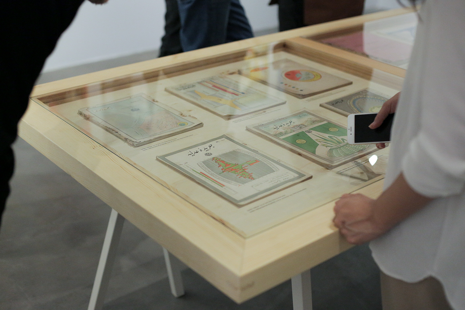
Cerîde-i Adliye issues, Ömer Durmaz personal collection
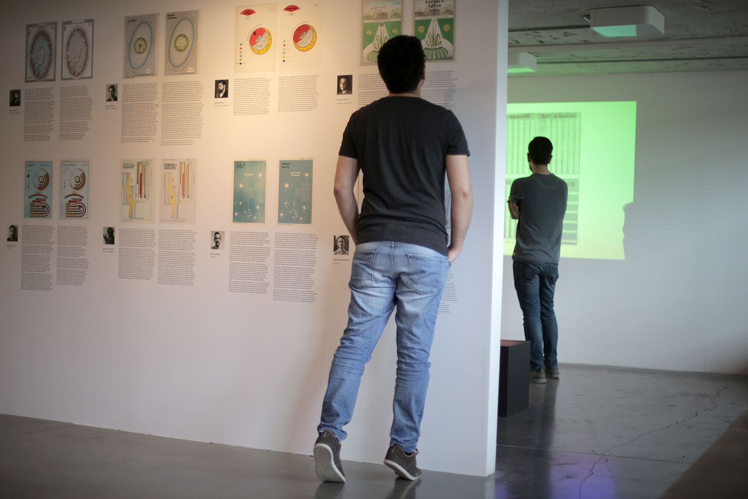
When Ömer started shaping this important exhibition, he told me that he had this idea of having a subsection titled “Measure of Justice” and asking information designers to interpret the covers of the Cerîde-i Adliye (“Journal of Justice”) journal from the 1920s (from his personal collection) which displayed extraordinary data visualizations, with motion graphics as end-products. Seeing these data graphics from the post-war Istanbul of a 100-years ago was exciting for me, and I helped him organize this project. We determined the 10 designers together (Barış Atiker, Daniele Savasta, Deniz Cem Önduygu, Emrah Kavlak, Emre Parlak, Gökhan Ersan, Mahir Yavuz, Mehmet Gözetlik, Tuğcan Güler, Ziyacan Bayar). Ömer commissioned the translations (from old Turkish written in Arabic script to modern Turkish in Latin alphabet) and vector drawings, and sent them to the designers. The designers chose the covers they wanted to work on; then they did the typesetting with their own typographic choices, and created 10 motion graphics / videos with different approaches and different technologies. The covers were exhibited both as print along with the designers’ comments, and as videos in a projection room. (My Big Picture in Seven Scales was also exhibited in a different section.)
 The cover I chose was of the 56th issue (dated 1 March 1927) of Ceride-i Adliye, and shows the numbers of convicts held in Turkish prisons as of 1 June 1926, organized according to the sentence length and type. My vector drawing & typesetting is below the original.
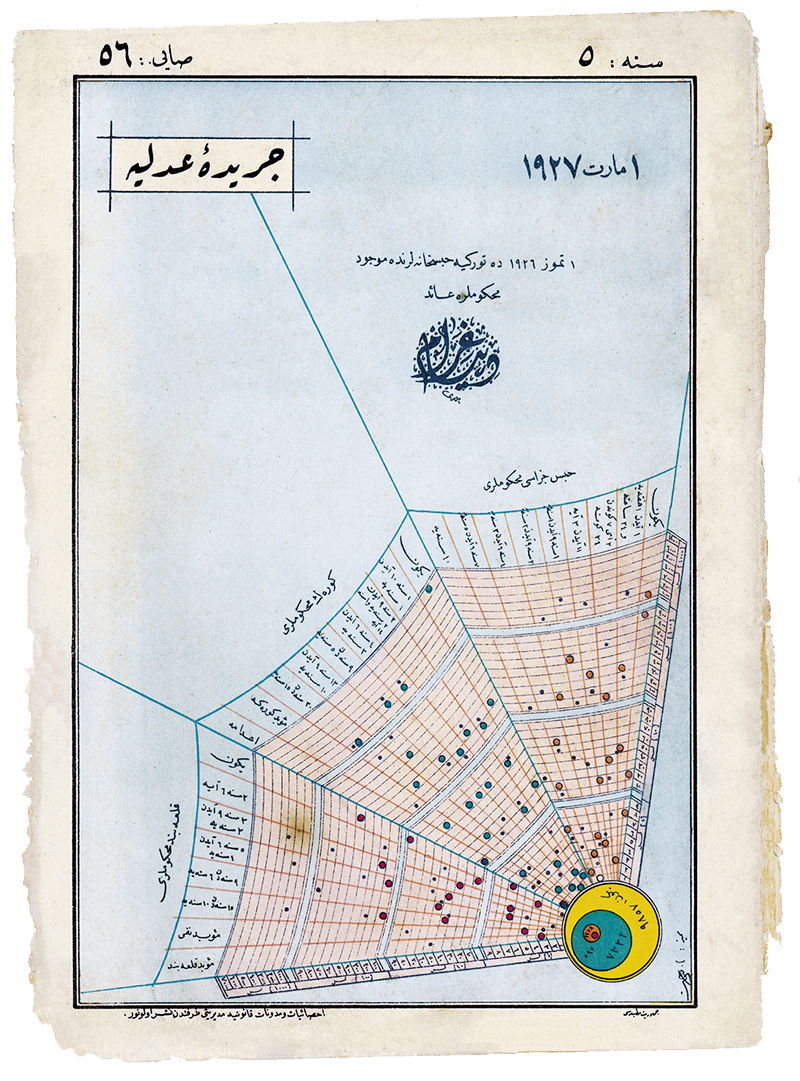
Cerîde-i Adliye, 56th issue (dated 1 March 1927), Ömer Durmaz personal collection
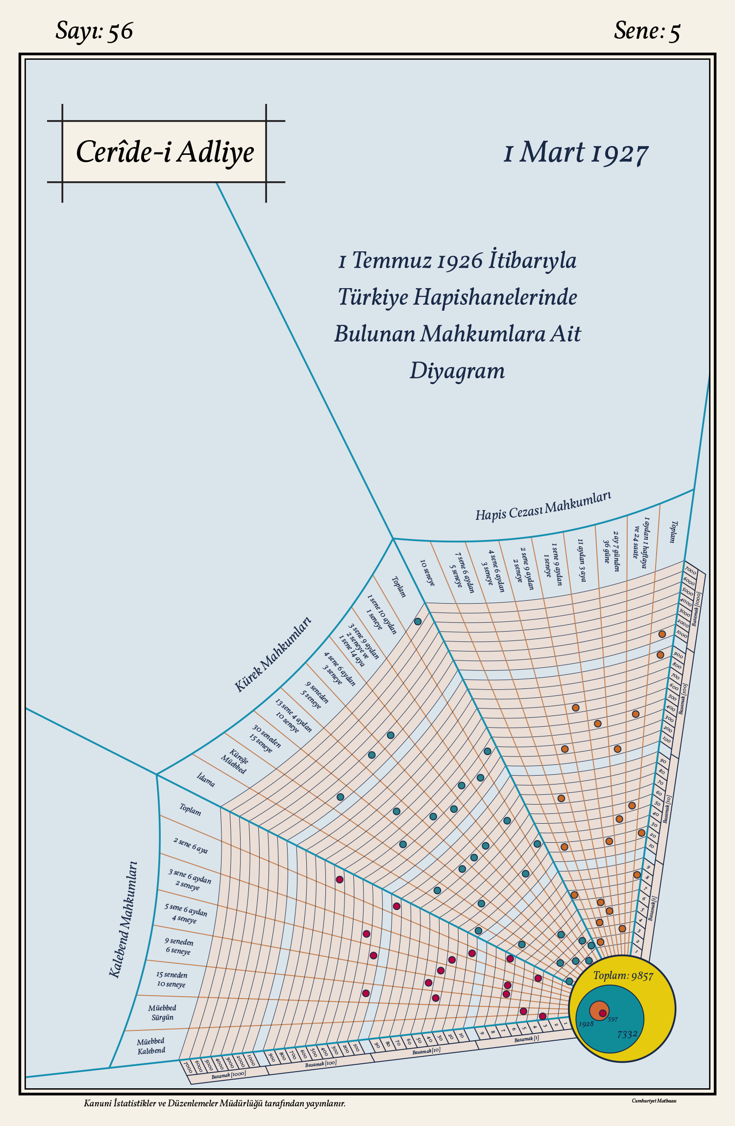 The main structure resembling a spider web is an example of the figurative approach avoided today in data visualization. The web metaphor here is somewhere between “excessive” and “acceptable” because it is only used to construct the grid, and the data points are drawn as abstract round shapes – instead of spiders/insects. Nevertheless, it is obvious that the unnecessary angles and the bent “threads” make it hard to read the values of the data points that are far from the axes.
The grid is split into three main sections for the three sentence types: prison, rowing, and fortress confinement. Each section is subdivided into columns for sentence lengths. The columns at the far right-hand side show the total number of convicts for each section. And the method of displaying the numbers is the most exotic feature of this diagram.
In data graphics, we normally use linear (or logarithmic, etc.) axes that represent homogenous continuities, and each data point represents a number by its projection on the axis (or as many numbers as the number of axes). On this diagram, however, the axis is divided into four parts for the decimal positions (ones, tens, hundreds, thousands) and the numbers are represented by 1–4 data points depending on their magnitudes. For example, the column at the far right-hand side (total number of prison convicts) shows four points for 1000, 900, 20, and 8 to represent the number “1928”. (Below is my motion graphics, where my choice of strategy was to help the viewer understand how to read this complex diagram.)
By choosing this way of representing numbers, the designer makes a compromise on one of the most basic features of data visualization – its power to make numerical entities easily and intuitively perceived using distances/proportions/colors. Here, we have to make calculations and reconstruct the numbers; the quantities and positions of the data points do not directly represent the numbers we are supposed to perceive. If we plotted the same data with a standard, linear axis going from 0 to 7400, the distribution of the points would look like the figure on the right, below.
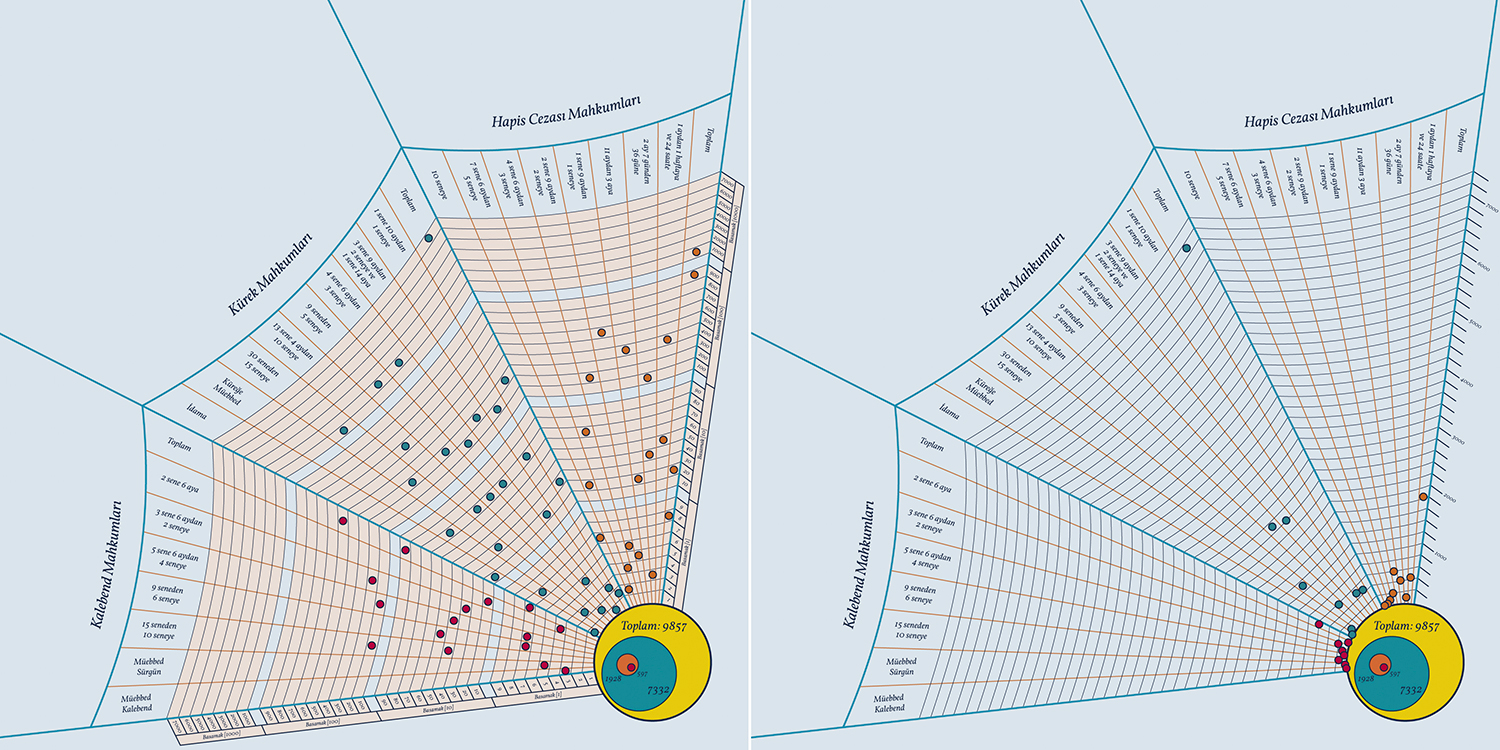 With the standard method, we can directly perceive the distribution with one look. But we also have a problem here: because the total numbers are shown along with the individual subsections, we have to display very big numbers and very small numbers together. When we set our axis according to the maximum value of 7332, the small numbers have to squeeze at the bottom. We have different solutions to this problem in data visualization, and the method of using decimal positions preferred by the designer of this cover does a good job of creating a visually homogenous distribution of data points for very big and very small numbers, even though it has the aforementioned problems. Another advantage of this method is that it makes it possible for the reader, with some effort, to learn the exact values (down to the ones position); with standard linear axes, we see the general distribution and patterns but can only have a rough idea about the values with such big numbers.
The diagram also shows the total numbers of the three main categories with big overlaying circles at the center of the web. Thanks to the consistent color-coding with the small circles on the web, we can easily understand which circle shows which category. However, the designer here makes a very common mistake in representing magnitudes with areas: the numbers are proportionate with the diameters of the circles. In fact, the areas, not the diameters, should represent the numbers, and this can be achieved by making the diameters proportionate with the square roots of the numbers – not the numbers themselves. Looking at these circles is very misleading if we want to have an idea about the related numbers of convicts.
—
The other covers of Cerîde-i Adliye also have various methodological problems in terms of data visualization. Most of these problems fall under the title of “sacrificing data readability in order to make it look much more interesting/complex than it is”. The other designers who worked on the covers mentioned these shortcomings as well. How common this attitude was in those years (in other countries) is a research topic on its own. And seeing these problems doesn’t diminish the excitement of witnessing these efforts for data visualization in 1920s Istanbul.

Trackbacks.- Adaletin Ölçüsü: Cerîde-i Adliye Kapaklarını Yorumlamak | Deniz Cem Önduygu