AN INTRODUCTORY PRACTICAL GUIDE
AN INTRODUCTORY PRACTICAL GUIDE
Learning to choose between typefaces is a long intellectual process. It is best to start with a safe list (example from E. Lupton) and to find your way around them first. To do that properly, you must have a look at the history of typography and analyze work done by designers. Then you may start to expand the list – if you feel the need.
There are various categorization systems for typefaces, based on their morphology and/or history. Start by learning to distinguish between SERIFED and UNSERIFED (SANS SERIF, from French) typefaces.

DO NOT use fonts just because you like the look of them. Make sure that the typeface you choose does carry the references and associations your design needs.

DO NOT use stylistically powerful typefaces in bodies of text; they are for display purposes – like a big title. Use generic, neutral typefaces for continuous text. (The list in topic 1 consists of such typefaces.)

Even for display purposes, DO NOT mix powerful typefaces with one another. One will be enough.

Compose with members of a family. A family consists of different weights/versions of the same typeface, like REGULAR, BOLD, ITALIC, LIGHT, CONDENSED, SMALL CAPITALS, etc.

Stay away from fonts that try to imitate hand writing, because they usually can’t. Typesetting and hand writing are different realms, and the fact that all instances of a letter look exactly the same in hand writing fonts creates a feeling of robotic imitation – excluding fonts using OpenType features to overcome this problem. Write on a paper and scan it if the design needs hand writing. (Calligraphic fonts can be okay because calligraphers really do try to make their letters look the same.)

Stay away from COMIC SANS. People really like to use it for some reason (see topic 7), whereas typographically, it is a disaster, as “it was NOT designed as a typeface but as a solution to a problem with the often overlooked part of a computer program’s interface” (VINCENT CONNARE, its creator) – that is, just for the comic balloons of Microsoft’s help dog.
I don’t even want to put an image of it here.
If the font you pick does not have the necessary accents (DIACRITICS) for the language that you write in, forget that font. To be able to write correctly is much more important than a cool typeface.
For editable documents to be shared with other people or for web pages, use universal system fonts such as ARIAL (HELVETICA on Mac), GEORGIA or VERDANA so that everybody will see the same thing. (This topic assumes that you’re not competent in methods of using web fonts.)
Typefaces have been carefully designed character by character since the 15th century. It usually takes years to finish one. DO NOT distort them; DO NOT pull or squeeze letterforms. Always preserve their proportions, or the ghosts of their designers will haunt you. (Find condensed/extended fonts if you need those forms.)

POINT SIZE is not the only parameter to consider when setting type. The term LEADING (or LINE-HEIGHT) refers to the vertical space between the lines of a paragraph. TRACKING (or LETTERSPACE) is a global parameter for the spaces between letters. KERNING is the adjustment of the space between two specific characters.
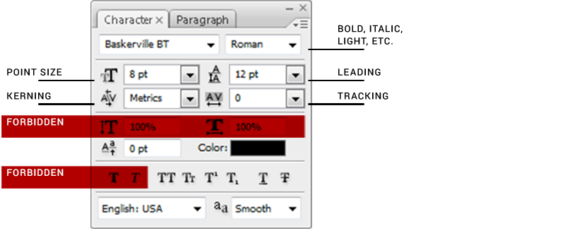
DO NOT use the BOLD and ITALIC buttons in the CHARACTER palettes of the softwares; they are called FAUX (FALSE) BOLD and FAUX ITALIC because the software creates them by distorting the typeface. Use the font menu to find the real BOLD and ITALIC, originally designed by the type designer. If there aren’t any, choose another font that has them.
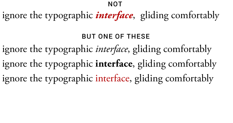
DO NOT emphasize with more than one signal.
Always have print-outs when deciding on point sizes for printed material. What looks okay on screen will feel huge on print.
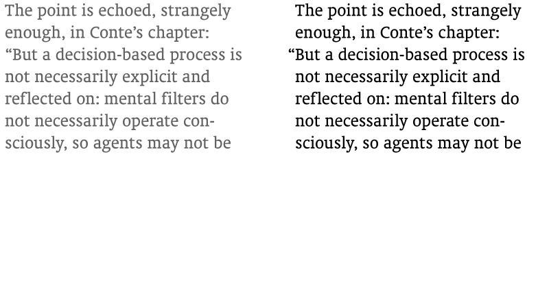
Adjust your column width and point size so that there are less than 75 characters in a line. Bigger line lengths look uninviting and make it hard for the reader’s eye to catch the beginning of the next line. Two (or more) narrow columns side by side usually look better than one wide column.
Minimum line length for a JUSTIFIED body is 40 characters. If your lines are shorter than that (if you have narrower columns), DO NOT justify, because it will mess up the spacing, creating holes in the body; flush left instead. Actually, forget about the 40 characters; always flush left.

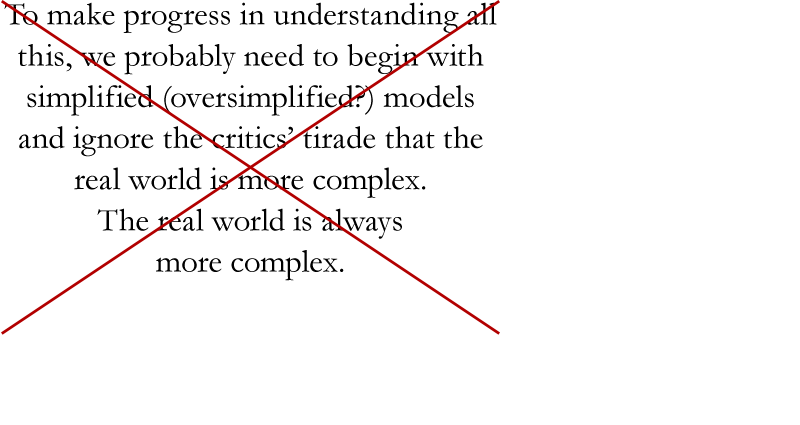
DO NOT center body text unless you are designing a headstone. Or an invitation. Save it for major life events like weddings and death.
Bodies of text usually require more LEADING than the default value of the font.

Add extra tracking for words written in CAPITAL (or SMALL CAPITAL) letters or series of numbers. DO NOT change the default tracking in continuous text.

Fonts have built-in KERNING TABLES, specifying the spaces between every possible combination of two characters. However, it is a good idea to check and manually adjust the kerning in large point sizes for display purposes. The OPTICAL option in the KERNING menus of the softwares may be useful.

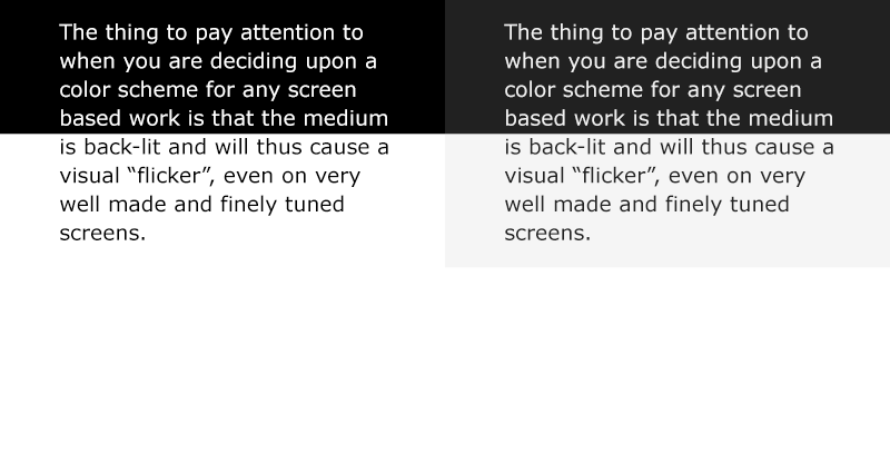
DO NOT use color for bodies of text. It’s either BLACK or WHITE (on a dark background).

In web design, the pure BLACK/WHITE can be toned down a little (along with their backgrounds) to DARK GRAY and LIGHT GRAY in order to make reading long bodies of text easier on the eye.
Applying effects (DROP SHADOW, STROKE, EMBOSS, GRADIENT, etc.) to type hardly leads to anything good. And DO NOT use strokes to make it bold. (See topic 11.)

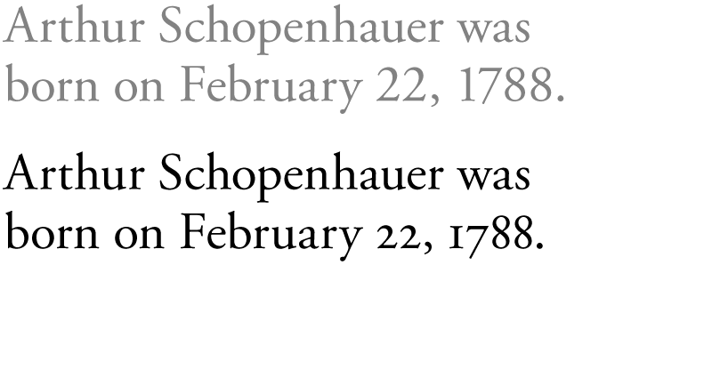
Use TEXT (OLDSTYLE) FIGURES (NUMBERS) with lowercase letters, if the font has them. You can find the option in the OPENTYPE menu.
Use ROMAN HANGING PUNCTUATION option in the PARAGRAPH palette to automatically let the punctuation marks hang into the margins.
The ideal GUTTER width (the distance between two columns of text) is two ems. One EM is a distance equal to the type size; for example, in 12 pt type, it is 12 points. You can use the width of the uppercase M as an approximation.

Use EM DASHES to introduce speakers in narrative dialogue. You can type an EM DASH with ALT + 0151 in Windows, or SHIFT + OPTION + HYPHEN in Mac.

Use EN DASHES with spaces – like this – to set off phrases. EN DASHES are also put between digits to indicate a range (1–10 October; 25–30 mm). You can type an EN DASH with ALT + 0150 in Windows, or OPTION + HYPHEN in Mac.
LIGATURES are special sets of characters designed for kerning issues or for purely aesthetic reasons. Use them properly; the ‘fi’ ligature, for example, should be turned off (from the OPEN TYPE menu) in languages like Turkish that have the letter ‘ı’ (the dotless ‘i’) to prevent misreadings.

Some of these are closer to being “rules”, and some are advices for safety in the beginning, which can be ignored or tweaked by experienced designers. It is best for starters not to know which is which.
April 2010, last updated in January 2017
REFERENCES
The Elements of Typographic Style by Robert Bringhurst
Thinking With Type by Ellen Lupton
Styles for Starters by Elif Ayiter