After ISType 2012
ISType (Istanbul Type Seminars) 2012 is over and here are my notes about it.
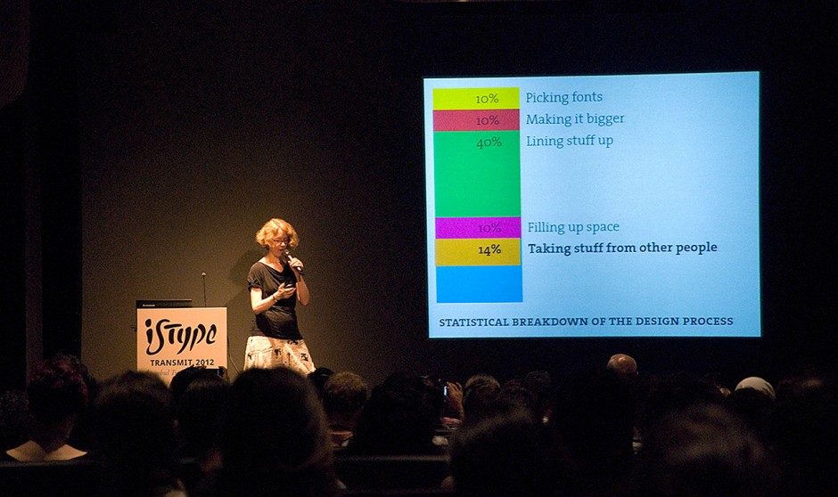
Right at the beginning, Ellen Lupton set the stage with her immensely funny sarcastic talk: “At the end of the day, it’s not the end of the world. It’s just graphic design…” And she was quite convincing, reminding us that 40% of what we do is just lining stuff up. (The list went making it bigger, filling up spaces, etc.)
Two topics were heavily dominant in ISType 2012: fonts for non-Western languages (discussed by older, more charismatic guys) and web/screen fonts (by young, cheerful people). There was an interesting tension between the Westerner speakers who are struggling with learning and designing fonts for the Arabic scripts (and complaining about how hard it is to create Arabic fonts with software and tools – like OpenType – devised by the “Latin” world) and the young people coming from countries where the Arabic scripts are used who claim that the kind of Arabic these Westerners try to learn and design is from centuries ago and isn’t relevant in the present day. “We don’t anymore use these super-complicated connections you’re trying to put into your font!” they were saying. (“I’m not designing for you people to use it, I’m doing it for old Arabic scholars.” could be an answer to that.)
Another cause of tension was Dave Crossland’s Lutherian speech about freeing fonts – in both senses of the word. Although he got a big applause from Ellen Lupton, I could feel that many people there who were making a living out of type were angry against this relaxed young man with shorts and slippers. Bruno Maag expressed his, objection, let’s say, in more than one occasion, the politest being “I’ll say this one more time! Good! Type! Is! Worth! Money! And you! Can make! Money! With type!”
Ömer Durmaz presented a great timeline that he did, showing important events worldwide and in Turkey in parallel with the Turkish graphic design history. He later told me that he is going to finish and publish it as an interactive website, and maybe as a poster.

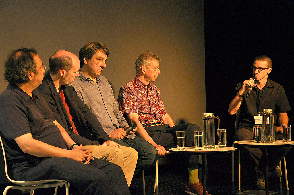
The History of Typography panel was amazing, covering subjects from the new Turkish Lira sign to the lack of a type classification and terminology that have become the norm – one possible reason, they said, for why art history writing doesn’t usually include type history. (Though I don’t agree with Bratislav Pantelić who suggested that typography is detached from the periodical ideologies, unlike art. To be able to say that, you have to hold that Jenson’s humanist faces have nothing to do with Renaissance, or that Futura isn’t the logical conclusion of modernism. Good luck with that.)
Yes, ISType 2012 was full of charismatic people but Jan Middendorp from MyFonts owned it with a simple sentence at the beginning of his talk: “I didn’t put the logo of my company in my presentation; it’s on your badges.” (The other two logos were Sabancı University and SALT, the venue.)
And for any curious type designers out there, I’ll be the messenger for Gerard Unger: “I don’t have any prescriptions for the future of type. But maybe, avoid the neutral sans-serif.”

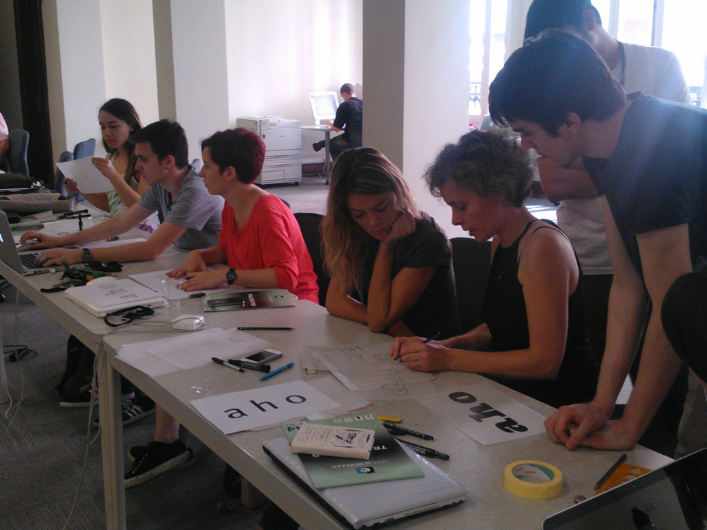
These are just some highlights from 4 fully-packed days, by the way. Onur Yazıcıgil, Alessandro Segalini and their team did an amazing job, way beyond my expectations. From the details of Arabic glyphs to the philosophy of typography, from the history of counterpunches to the latest OpenType tricks, from the big-business world of fonts to the open-source inspirations, from panels to workshops, ISType 2012 has covered a very wide spectrum very successfully, with people from all over the world, and with nearly no technical problems. Plus, the branding of the event kicked ass. I hope and believe that they will have the motivation and support to continue this series of seminars in future years.
Addendum
- A longer review in German with lots of photos is available here.
- The official Flickr album and Vimeo page for ISType 2012 contain visuals from the event.


Leave a Comment
Join the conversation.