

Big Upgrade: Portraits, Name-Clicking, New Filters, Mobile Version, and More
This is an important moment and an important post for me. It’s not about the new philosophers and sentences I was able to add, as usual, but about the long-pending interface features and improvements that I was able to implement in the past few weeks. This is a substantial upgrade for the user experience and the information visualization capabilities of this project, including functions that I’d personally been looking forward to for years.
Portraits
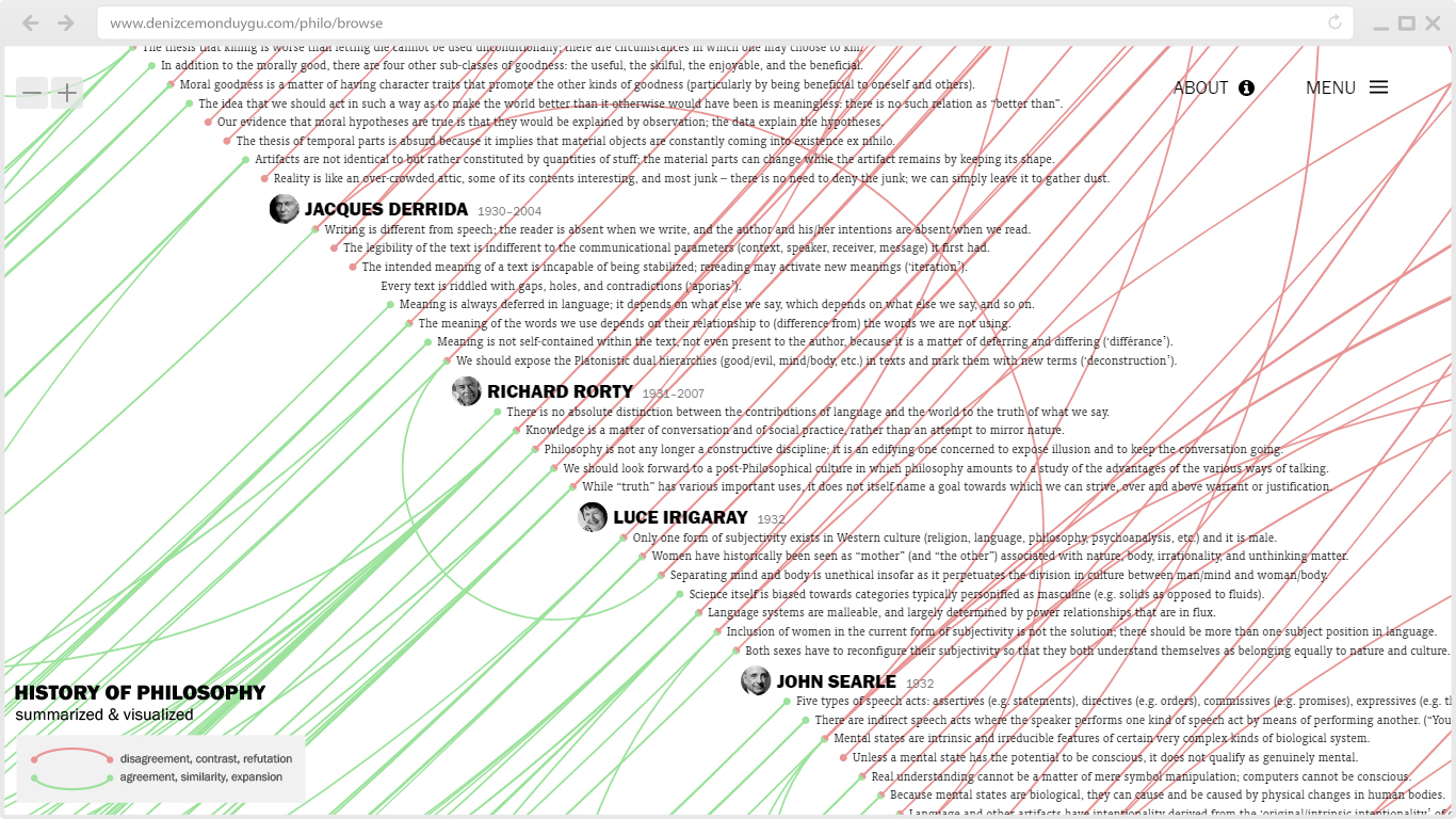
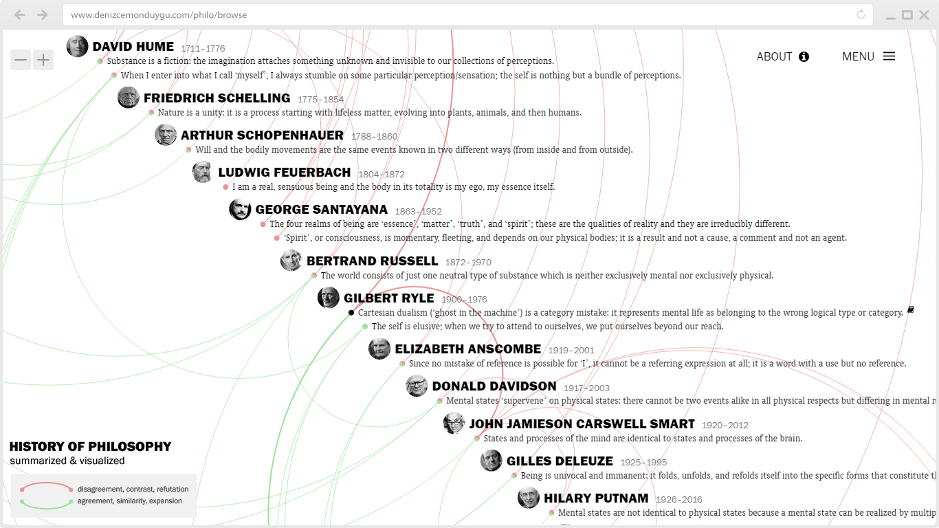
Let’s start with the most visible change: the addition of the philosophers’ portraits – their photographs, or photographs of sculptures or paintings depicting them. When I first thought of this and did a static sketch, I was happy with it. But when I implemented and experienced it interactively, I was not sure if this was something I’d like to see all the time and worried that it might make it hard to concentrate on the text (especially on the sentence screens). Then it grew on me again. In any case, I’ll add a toggle switch in the menu for those who might want to hide the portraits.
Name-Clicking
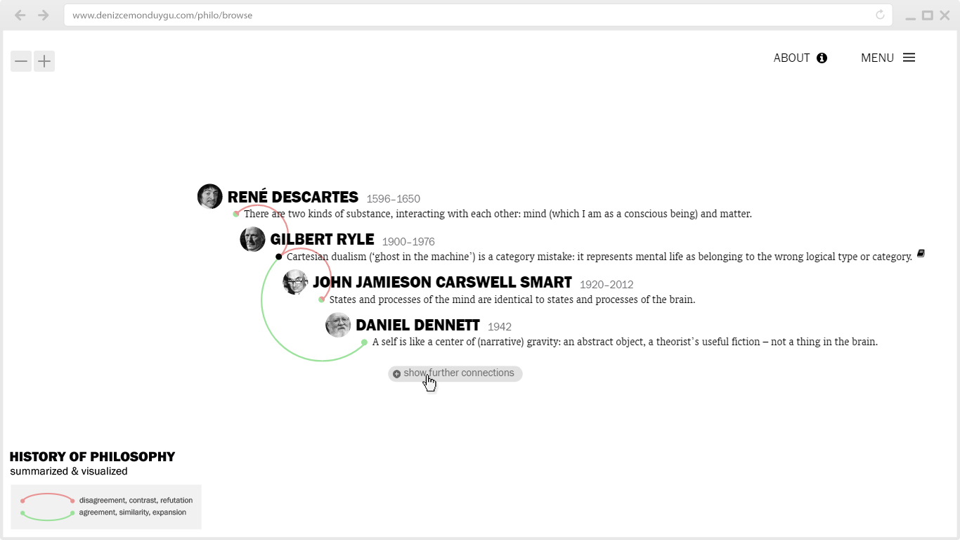
Speaking of philosophers, one of the most important parts of this upgrade is the introduction of a function that I’d been meaning to add since the beginning: You can now click on a philosopher’s name (and portrait) and go to a new layout where you see all sentences by that philosopher, along with the connections of those sentences.
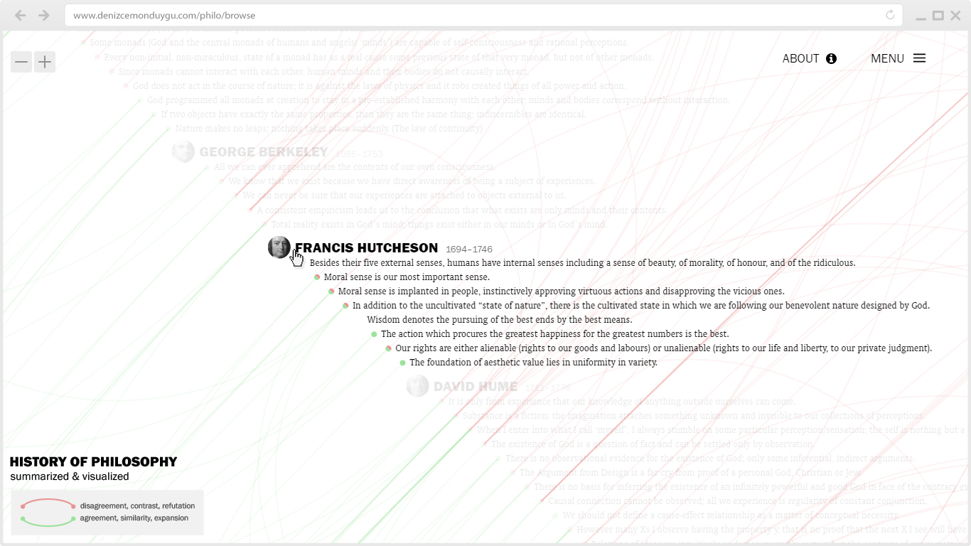
This allows the viewer to learn/remember about a person – see who they (would) agree/disagree with, on what topics – in one look, without clicking on their sentences one by one. Looking at this layout has the advantage, compared to the global view, of quickly scanning the agreement/disagreement relationships between the selected philosopher and the others because all of the connection lines stem from that person – there are no lines drawn between the sentences of the other people we are seeing. This feature also acquires a second function as it generates summaries around a subject/theme/school in cases where the bulk of the selected philosopher’s content is about a specific subject or has an overall theme; just click on Simone de Beauvoir to start learning about the history of feminism/gender…
Showing Further Connections
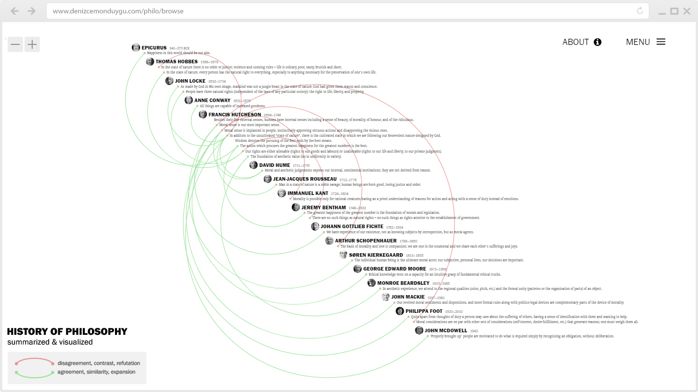
Another big change is in what the “show further connections” button (SFC) does. This is the button that appears at the bottom when you click on a sentence and see its connections; when you click on SFC, it displays the sentences connected to those sentences connected to the main sentence.
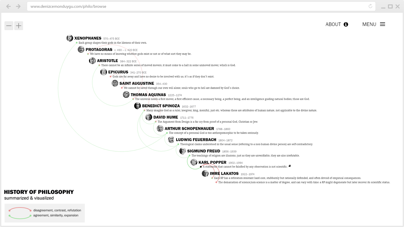
The previous algorithm worked like this: if the connected sentence is located in the past of the main sentence, show only its past connections (and their past connections, and so on) and if the connected sentence is in the future of the main sentence, show its future connections (and their future connections, and so on). This time-directional limit was something we chose to apply because we wanted to decrease the number of sentences SFC showed, since a limitless and recursive (connections of connections of connections…) algorithm was showing a huge number of (mostly unrelated) sentences, making the act of “showing further connections” lose its meaning.
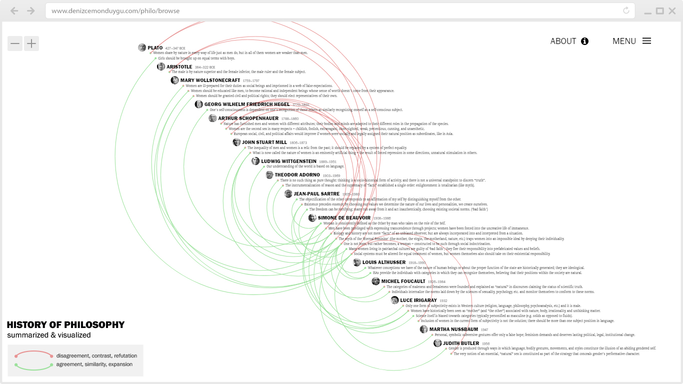
But I was not happy with our previous solution for two reasons: (1) it still was showing too many sentences most of the time, with weaker and weaker conceptual connections to the main sentence (not something I envisioned at the start), and (2) the directionality was skipping many second degree connections that happened to be in the “wrong” direction, albeit very much related to the main sentence. So I decided to get rid of the recursion and the directionality both, making SFC reveal all and only the second degree connections of the main sentence (the first degree connections of the sentences directly connected to it). And I’m very satisfied with the result.
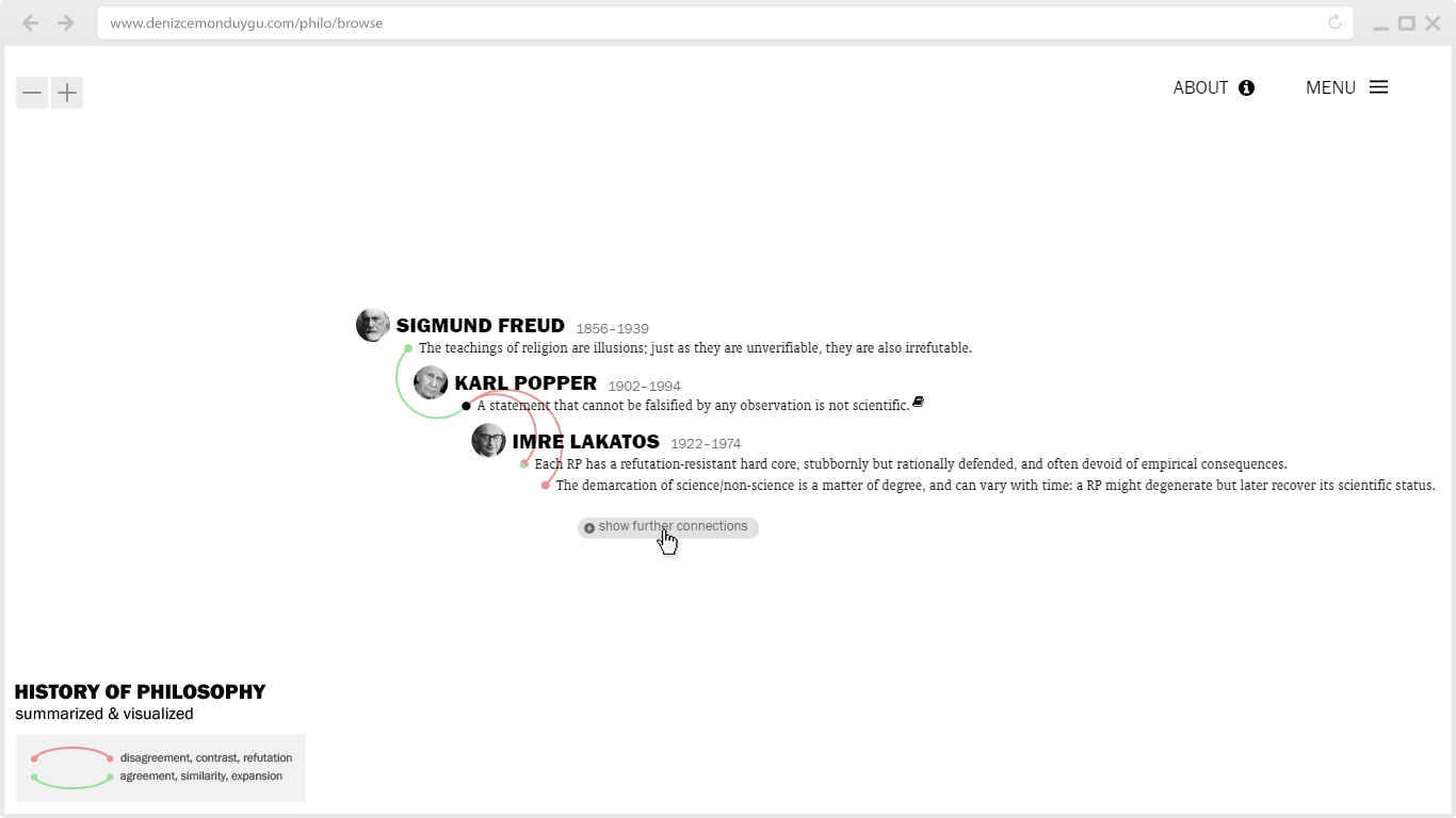
What the old SFC did:
What the new SFC does:
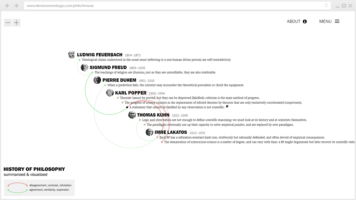
The new SFC is better at generating summaries about a subject/theme/topic because it doesn’t go too far conceptually (it stays in context) and doesn’t skip much-relevant sentences like the old SFC did. Not going too far doesn’t always mean a small amount of sentences: in my comparisons, I’ve seen that there are many cases where it actually shows more sentences than the old SFC did, but they are more relevant. Plus, unlike the old algorithm, it displays the related sentences from the owner of the main sentence as well, because they are connected to other people’s sentences that are connected to the main sentence! (There’s also been a self-correction function of SFC for me: even if I forget/miss an obvious connection between X and Z when I take my notes about X, SFC brings Z into the picture by showing X-Y-Z and I then add it to the database. This role of SFC has also gotten better for me with the new algorithm.)
I’m quite confident that this change in the SFC and the new name-clicking function together bring a serious positive change for the experience of those (like me) who spend time using this interface to learn/understand/remember philosophical concepts/themes/positions. These two functions amount to something more than mere interaction features: they offer new networks of meaning for the human eye. That’s why I see this as an important moment in the history of this project.
New Branch Filters
I started this project 8 years ago with Magee’s The Story of Philosophy, and the six branch filters were enough for the most part at that time. As the content has expanded over the years and started to include more recent philosophy, I’ve increasingly found myself in situations where more specific branch tags (philosophy of language, of mind, etc.) were necessary for the sentences I was including. For that reason I needed more space in the menu, so I changed it into a two-column structure and added five new branch filters. And yes, I went through 1458 sentences to tag them with the new categories, as a quick first attempt – it’ll get better with time.
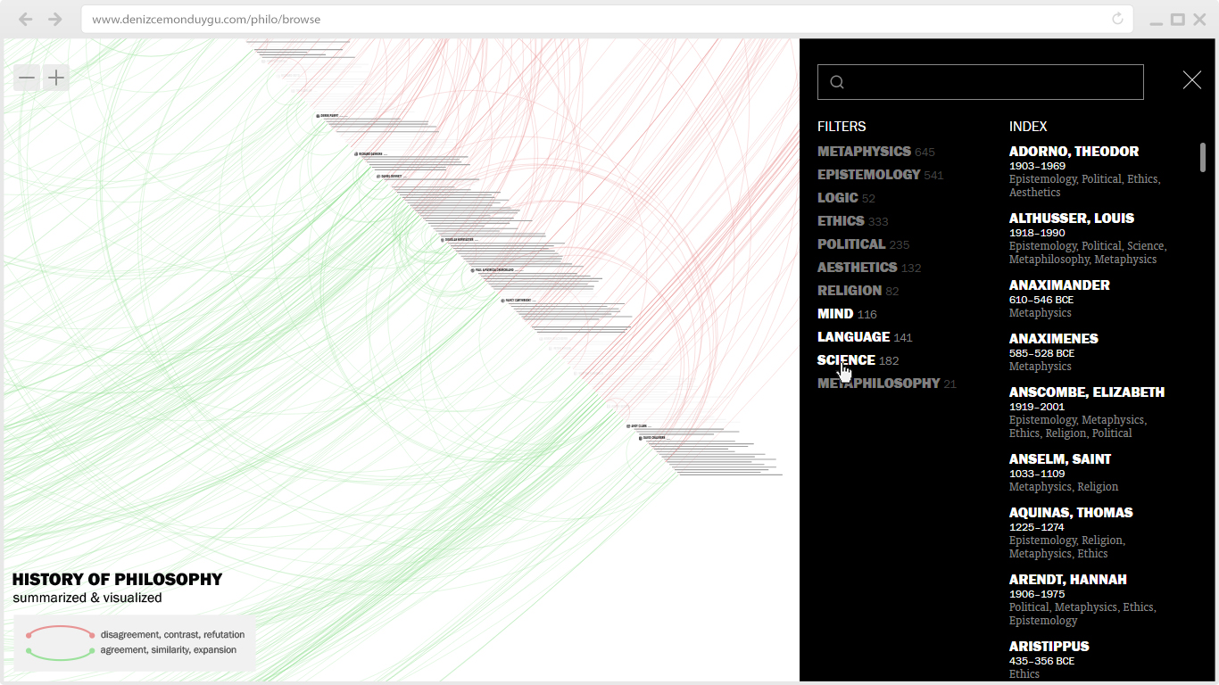
I also added the dates for every philosopher in the Index and removed their sentence counts. In the future, the space below the filters will host toggle switches for new options such as ‘switch to night mode’, ‘display portraits’, etc.
Zoom Buttons
During the process of making these upgrades, there were times I strolled into my wife’s office room to rudely interrupt her work and check how it looks on her computer (different OS, different screen size). She’s one of those weirdos who work long hours with the touchpad instead of a mouse, and seeing her struggle with zooming in/out using her battered touchpad, trying to follow my commands (“Now do this… Now go there… Now click here…”), has finally persuaded me that I should add zoom buttons for these poor people. They are in the upper-left corner.
Mobile Version
Mobile experience was always an issue for this project; suffice to say, it was not usable due to many UI and UX problems, and I didn’t care much because I was not a mobile person myself. (Remember, I’m doing all this for my own use…) I solved nearly all of those problems in this upgrade. Now you can seamlessly browse the whole thing on your mobile device; panning, clicking on sentences and names, using the SFC button, and using the alphabetical Index in the Menu to jump to a philosopher – a feature especially useful on mobile because it’s harder to pan along the whole timeline on a small screen. That’s why I spent the most time solving the bugs of this function. The only minor issue left is that it requires a double-tap on the name in mobile devices.
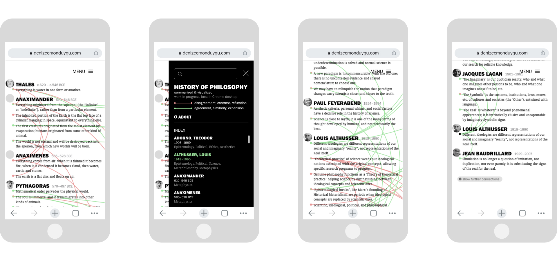
Another problem we were struggling with on mobile was that you couldn’t pan when your fingertip happened to be on a sentence; this was a nightmare in sentence-crowded locations. My current workaround is to limit the sentence tap areas to the left side of the screen, and leave the right side for panning. (Sorry lefties.) A good way to get used to this is to aim for the dots at the left when you want to tap on sentences.

Compared with the desktop experience, the only features the mobile lacks now are filters (not much required for the small mobile screen anyway) and the reference icon (to-do for the next upgrades).
—
In addition to everything above, I was able to fix many navigation and display bugs both for mobile and desktop. There still are some left, hopefully to be minimized even more in the future.
I thank my developer friend Yasin Meydan for his help with some of my questions.
Hope you enjoy.