

Version 6 Launched: New Visualization Methods, New Filters, New Interface
Alright, this is big. I’m proud to announce the most extensive upgrade in the visualization capabilities and the user interface & experience of this project since 2018.
I was able to develop many features I’ve been dreaming to implement for years in a few weeks thanks to AI-assisted programming. (None of these features was suggested by AI – I’m relatively tech-resistant and I only use AI to get technical help, mostly in programming. I never use it to generate ideas, text, or data.) I won’t list all of the novelties here in order to be able to publish this post in a reasonable timeframe, but here are the most important ones.
Three Main Views
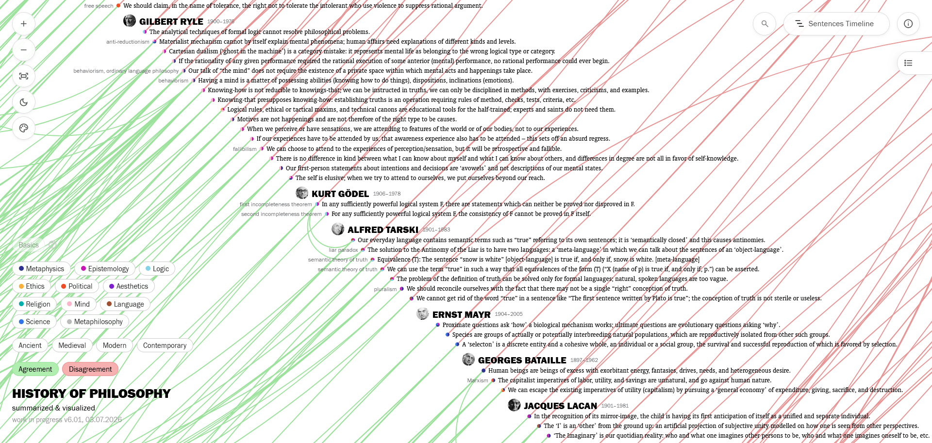
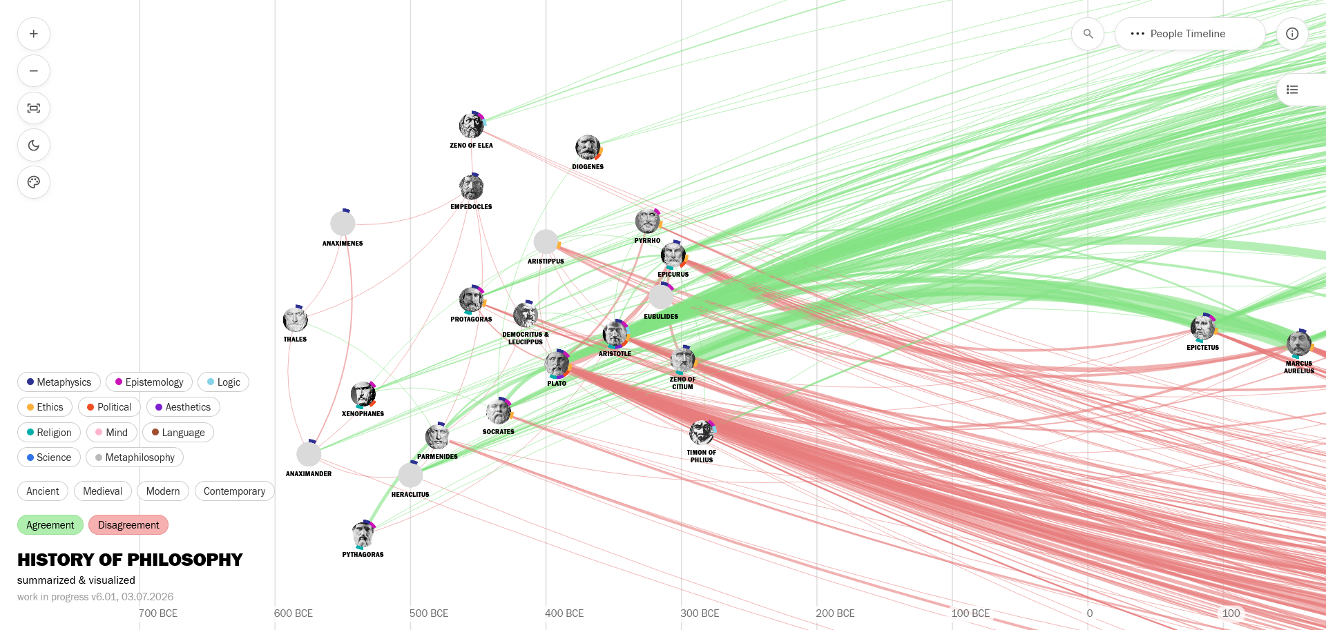
We now have three different visualization methods to explore my research: in addition to the old Sentences Timeline, you can now easily switch to the People Graph, and the People Timeline, using the toggle at the top right.
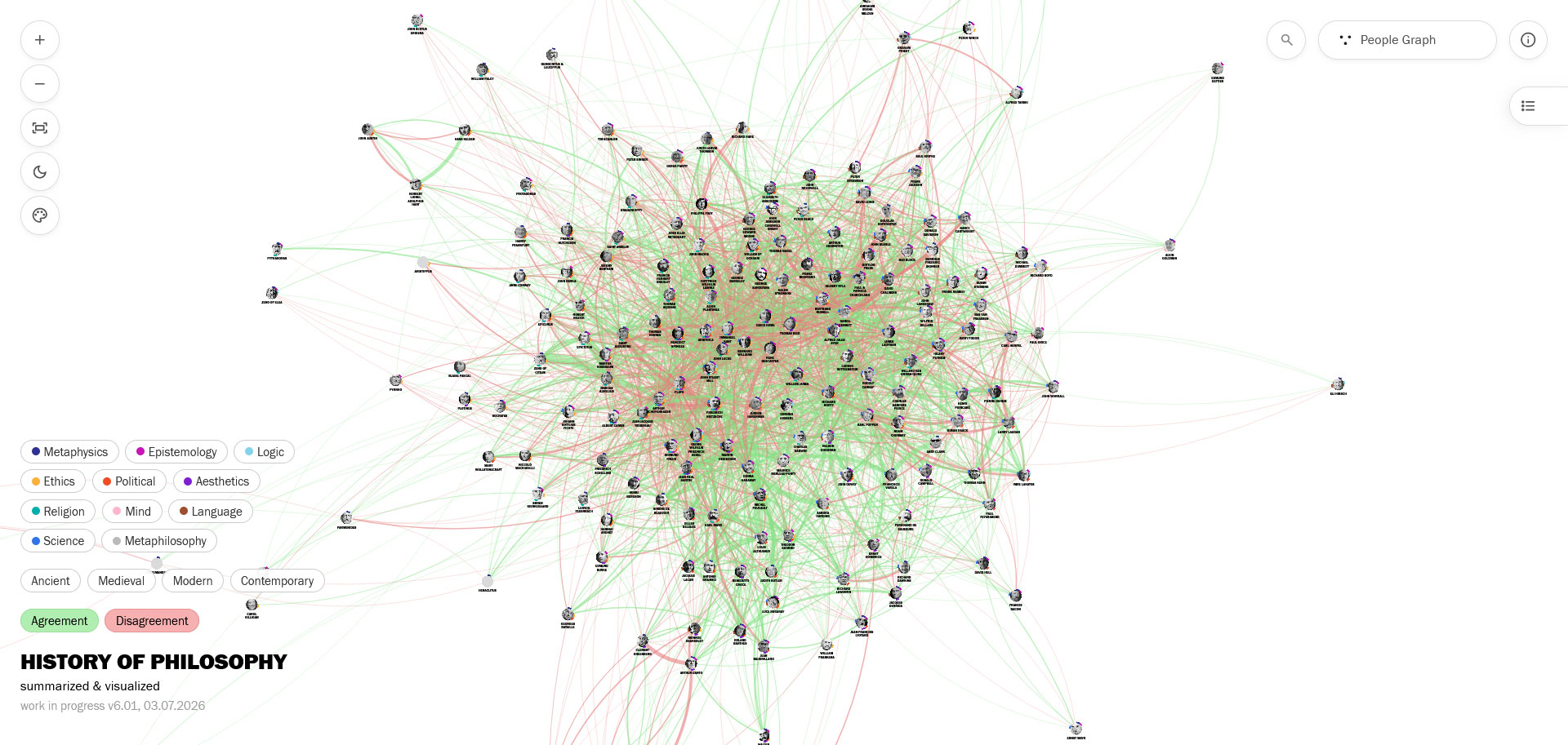
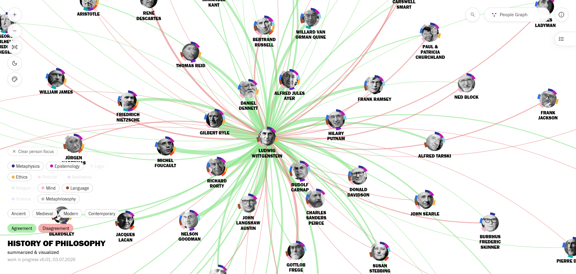
The People Graph is a force-directed graph with philosophers (instead of sentences) as nodes. It’s a new, more advanced version of the one I first created using Kumu last year. You can read about some design decisions here on my old post.
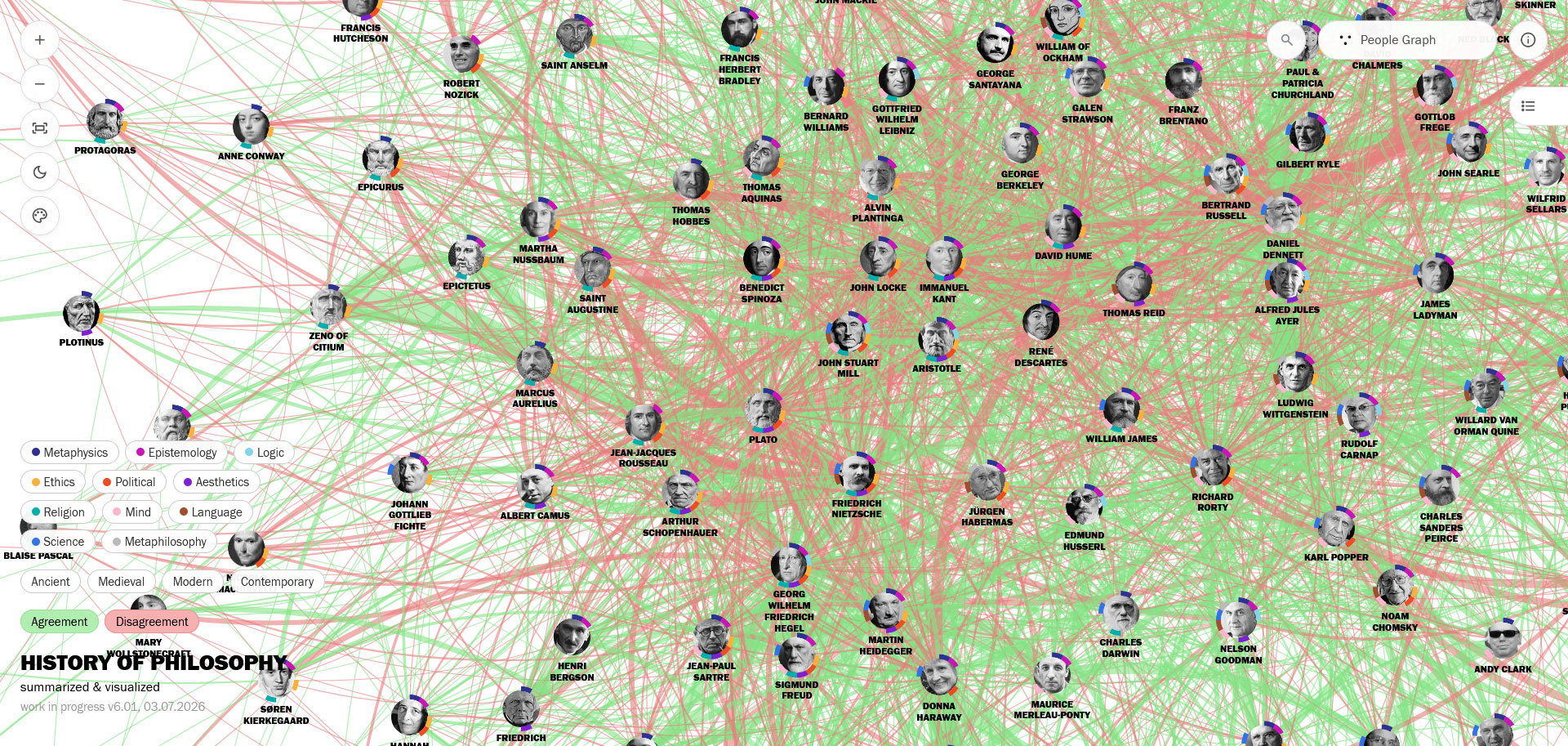
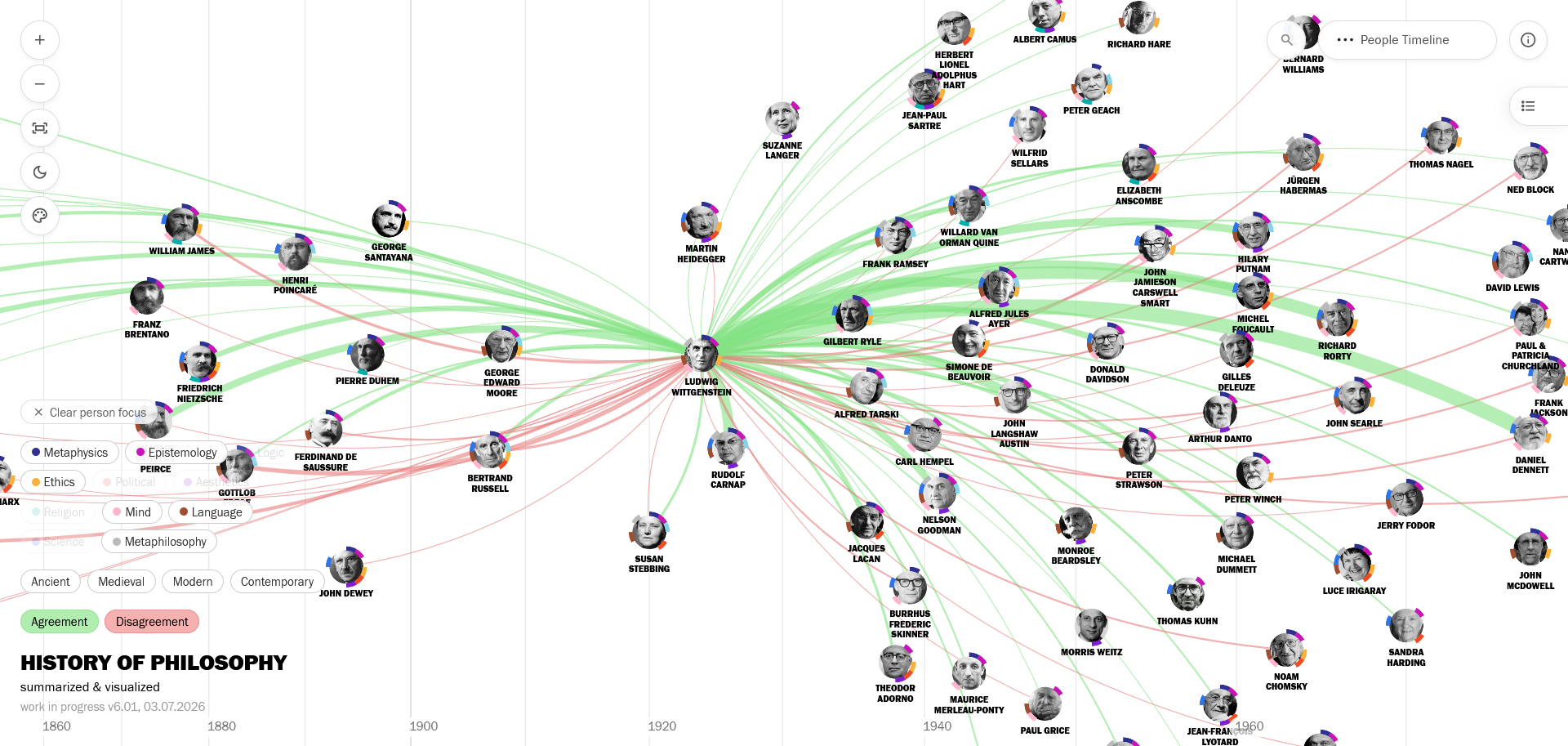
The People Timeline is a surprisingly insightful version of the force-directed graph, which locks people’s horizontal positions on a timeline, to add a chronological dimension. (I used “birth year + 35” for the horizontal positions, as an approximation of the beginning of the philosophers’ “active years” – of course there are many exceptions, but it’s good enough for the purposes of this visualization, as a first step. And I designed a time scale change after 1800 to better visualize the density in recent centuries.)
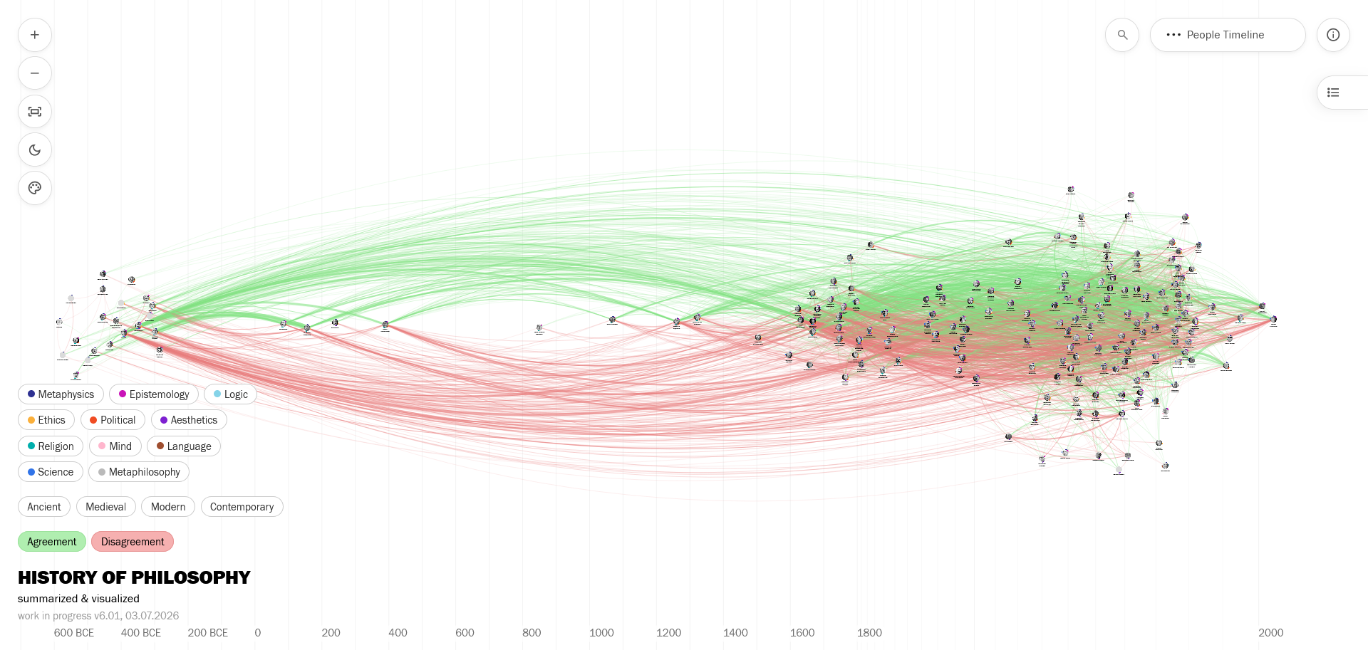
These new People views also allow you to easily focus on a philosopher and their connections with one click.
New Filter System
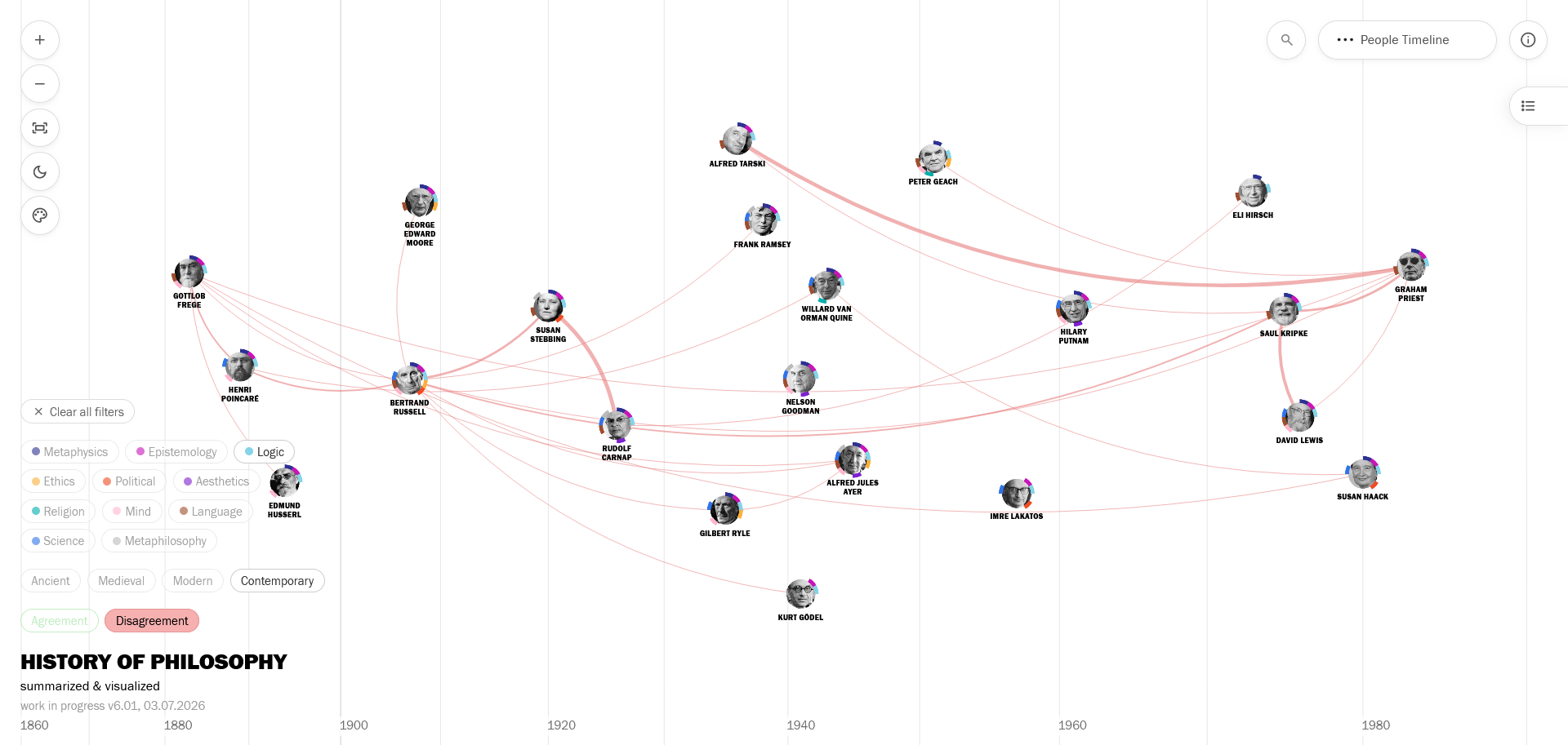
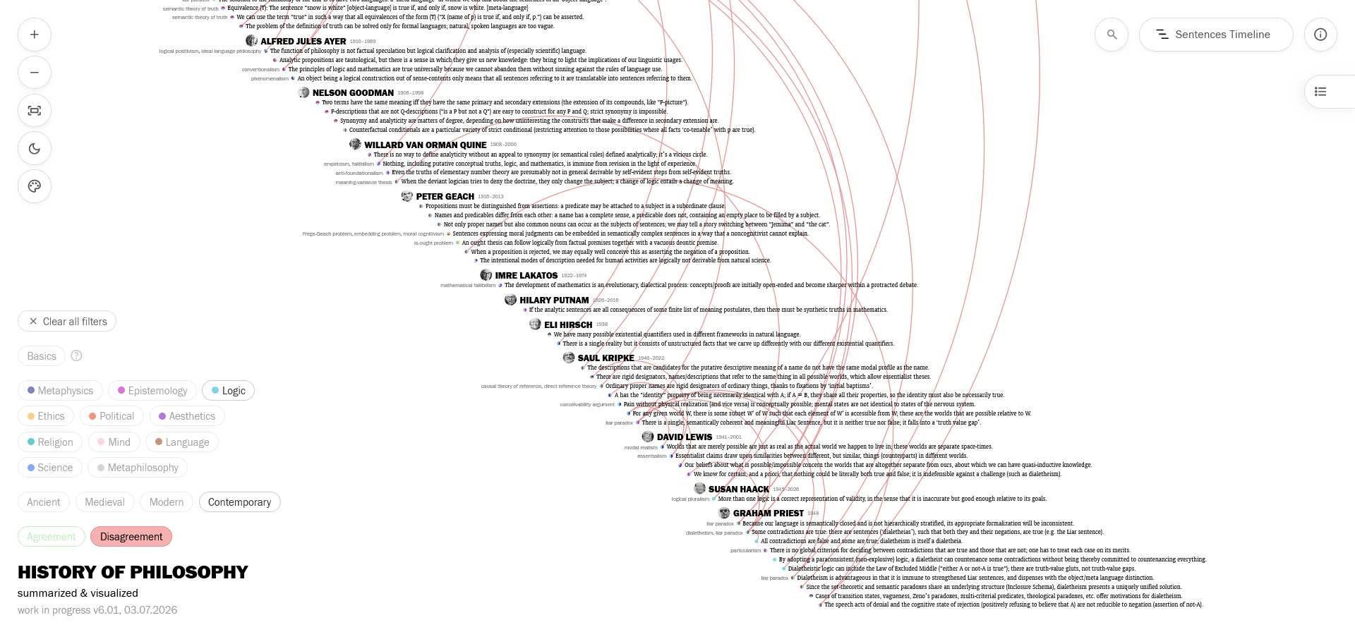
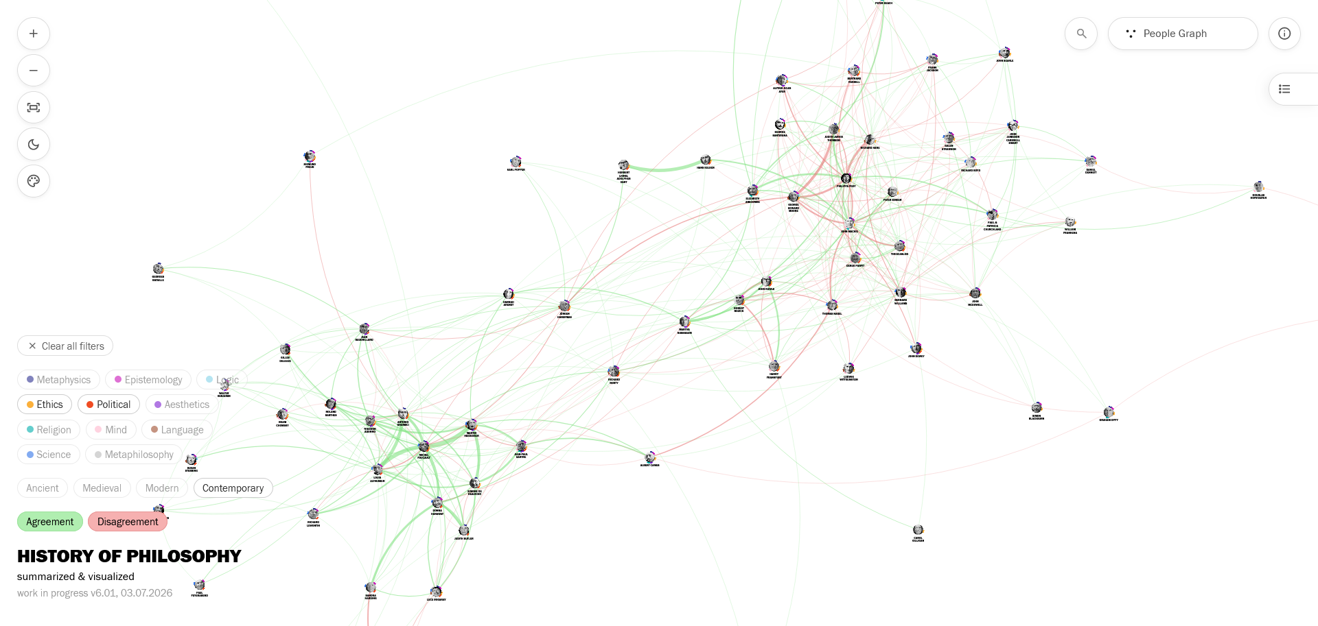
These three methods look exciting, but the real fun starts when you start to apply the new filters: I took special care to make the new filtering system work with branch-specific connection weights (in people views), multiple selections, and smooth transitions across the three main views. So now you can see how (1) contemporary philosophers (added in my research so far) who write on (2) logic (3) disagree with each other in a timeline, then go see their sentences by switching to the Sentences Timeline, etc.
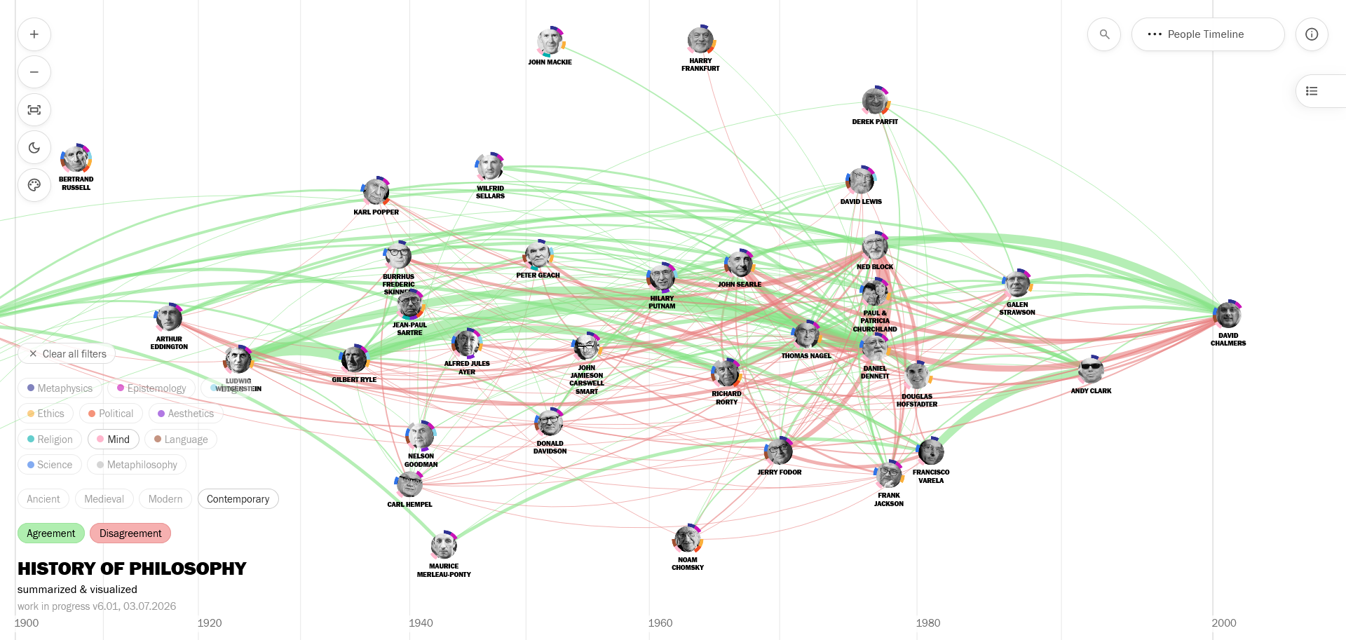
Or see the relationships in (1) contemporary philosophy of (2) mind on a timeline:
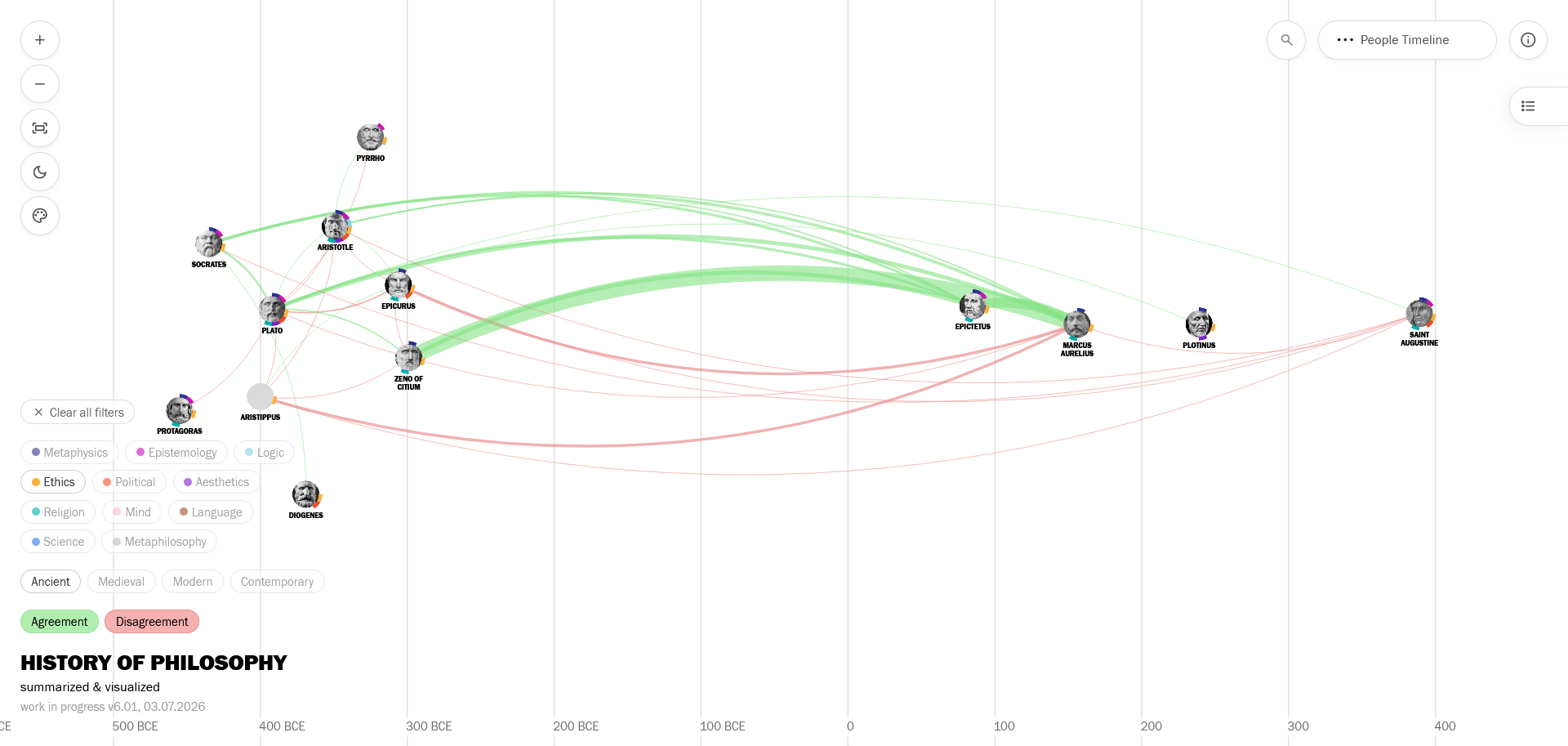
Or see the (1) ancient philosophers who write on (2) ethics:
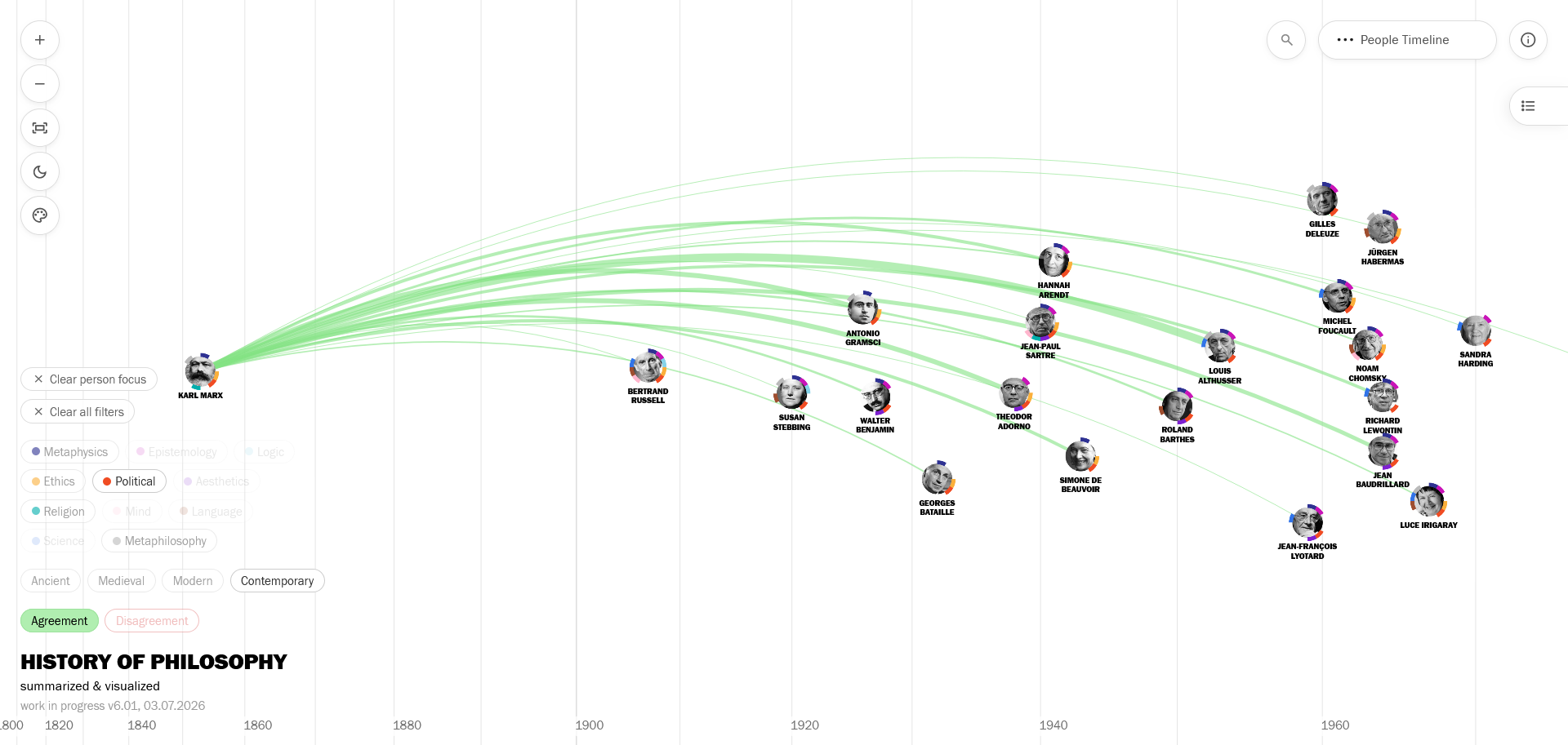
Or see the (1) agreement connections of (2) Marx in (3) political philosophy with (4) contemporary philosophers:
The option to filter connections by branches recalculates the connection weights according to that branch; when you click Ethics, only connections between ethics sentences are visualized. This can reveal meaningful clusters in People Graph; for example, Political + Ethics + Contemporary filtering shows two groups corresponding to analytical and continental traditions (even when there’s no such explicit categorization in my research), with people like Rorty and Habermas in between.
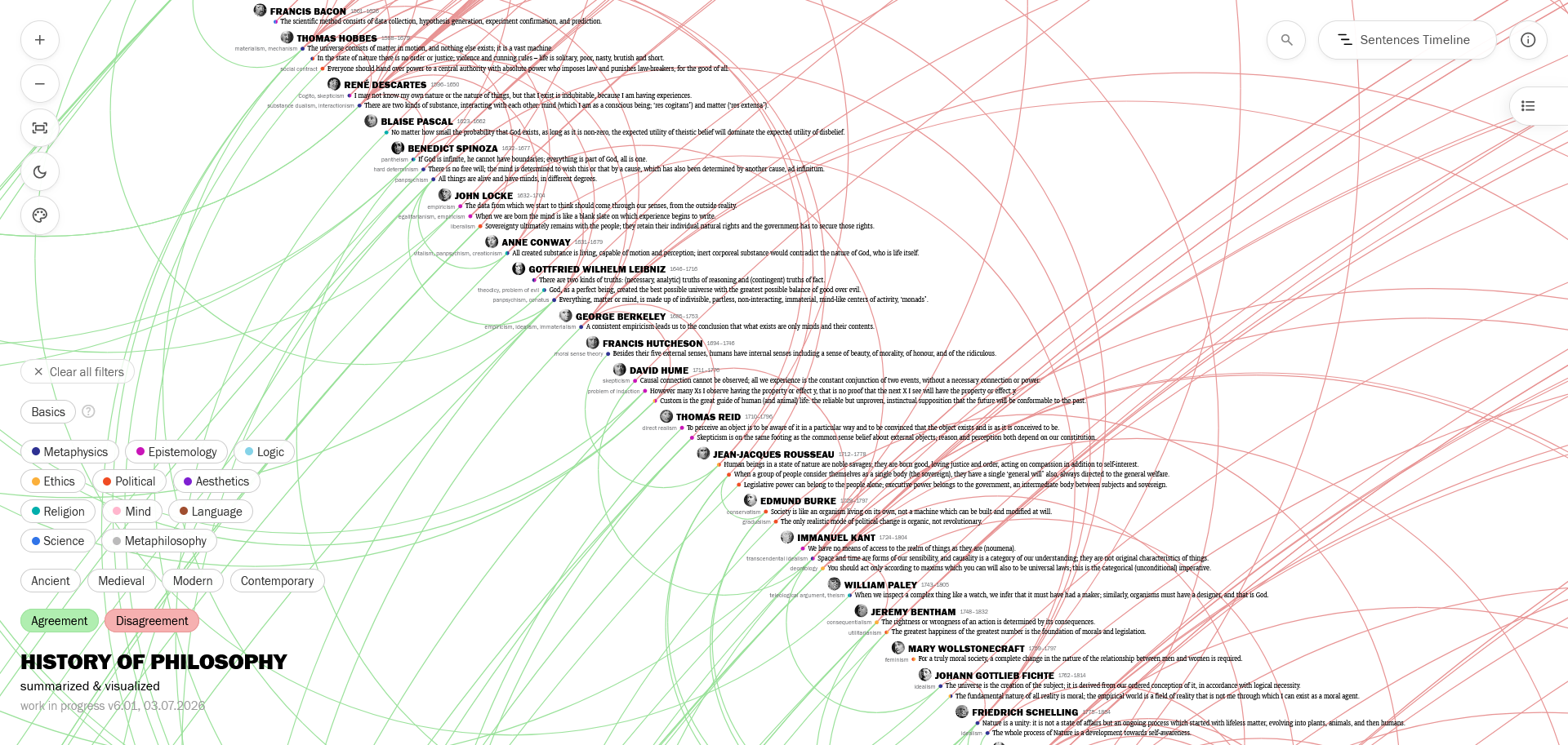
The Basics filter I had previously implemented works on the new version too: If you’re new to philosophy, you can use it to see few select prominent ideas for each philosopher as an introduction.
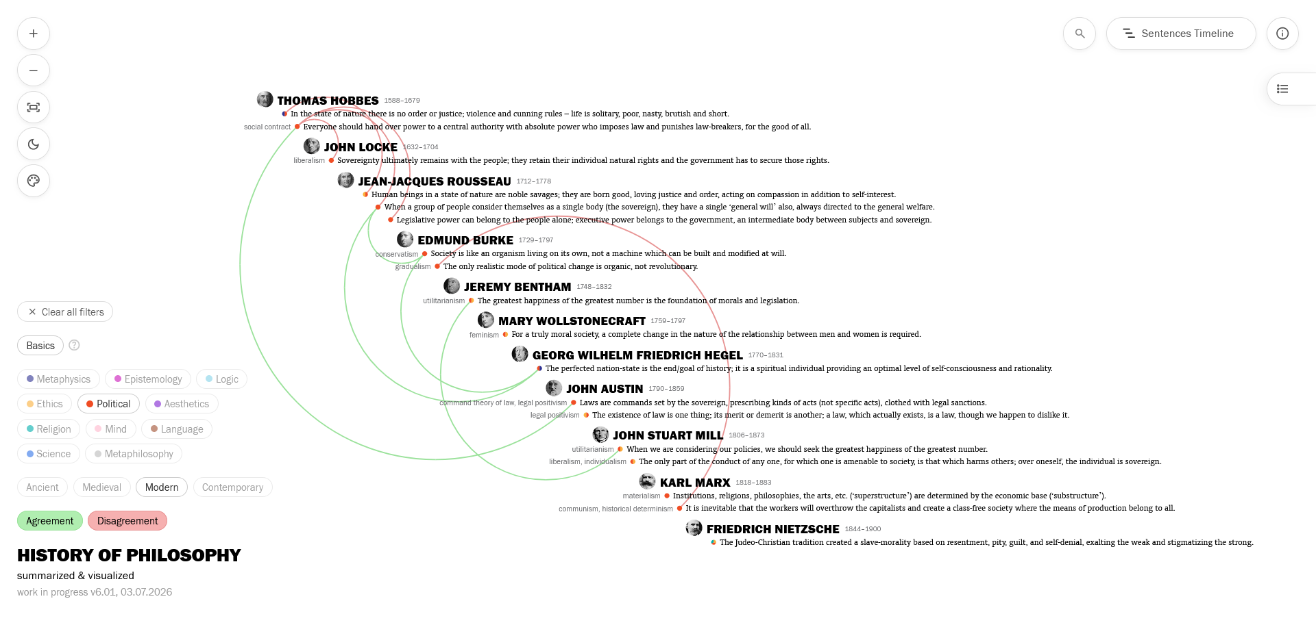
You can also add other filters to get overviews such as the basics of political philosophy in the Modern period.
Color-Coding for Branches
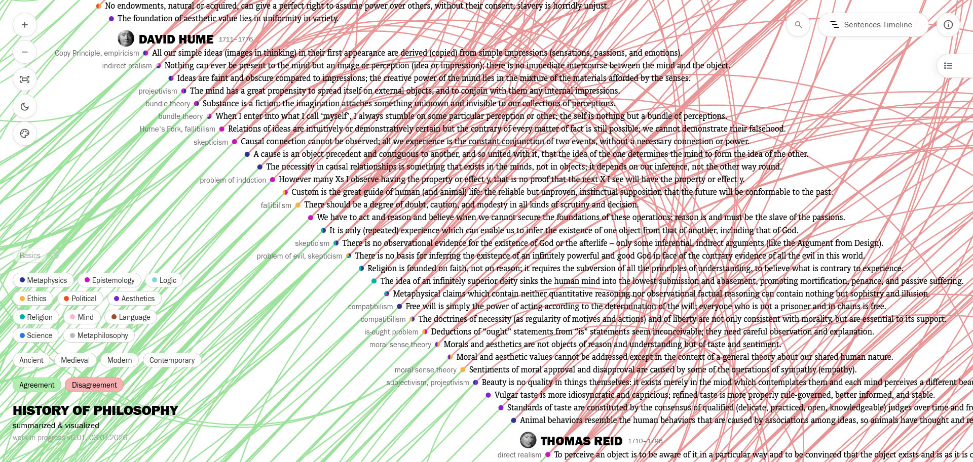
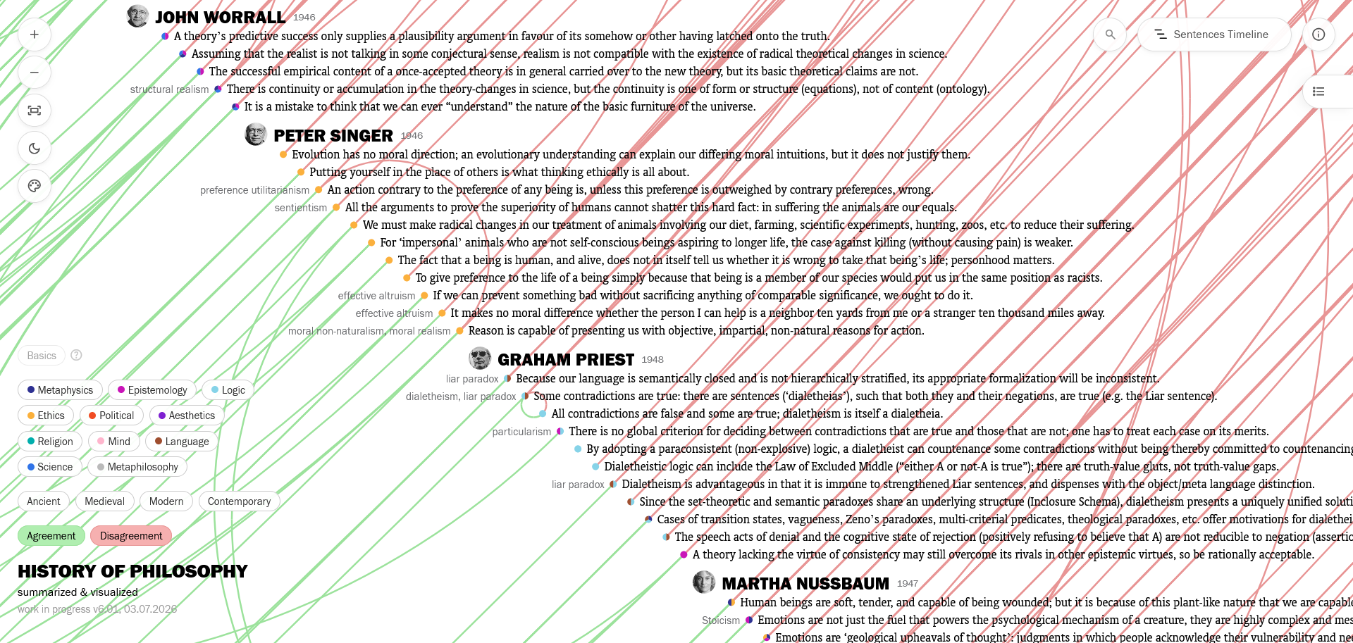
With all these nice branch filters on the bottom left, I also added a color-coding to the sentence dots: they take their colors according to the branches they belong to, constructed like a pie chart if they have more than one branch.
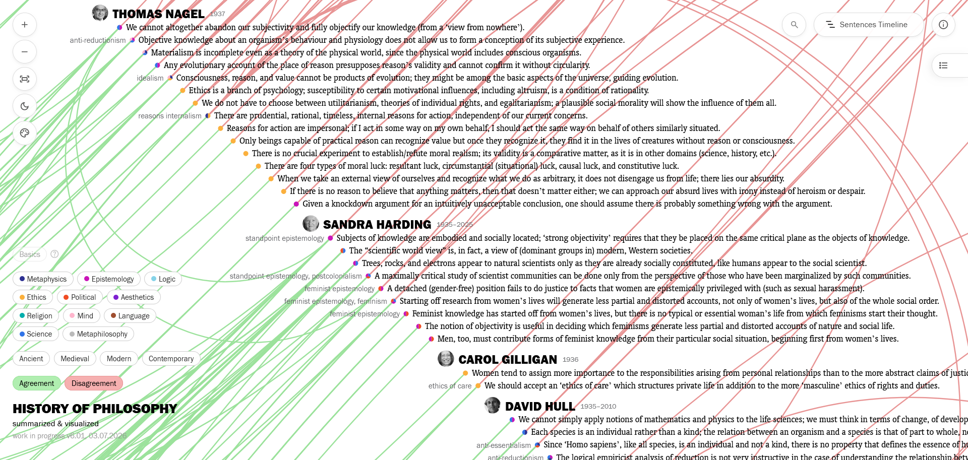
But don’t be overwhelmed by this feature! You don’t need to distinguish all these colors and remember their meanings in order to benefit from it – it already is informative without looking at the legend, because it lets you see how diverse a philosopher’s output is, or which philosophers work in similar or different branches at a glance. (And in my experience, once you spend some time and get used to the colors, it can really allow you to read the branches.) The same color-coding is also present in people views, as flags around the philosopher nodes, with unchanging branch-specific angles to make it more readable.
Tags and Names Panel
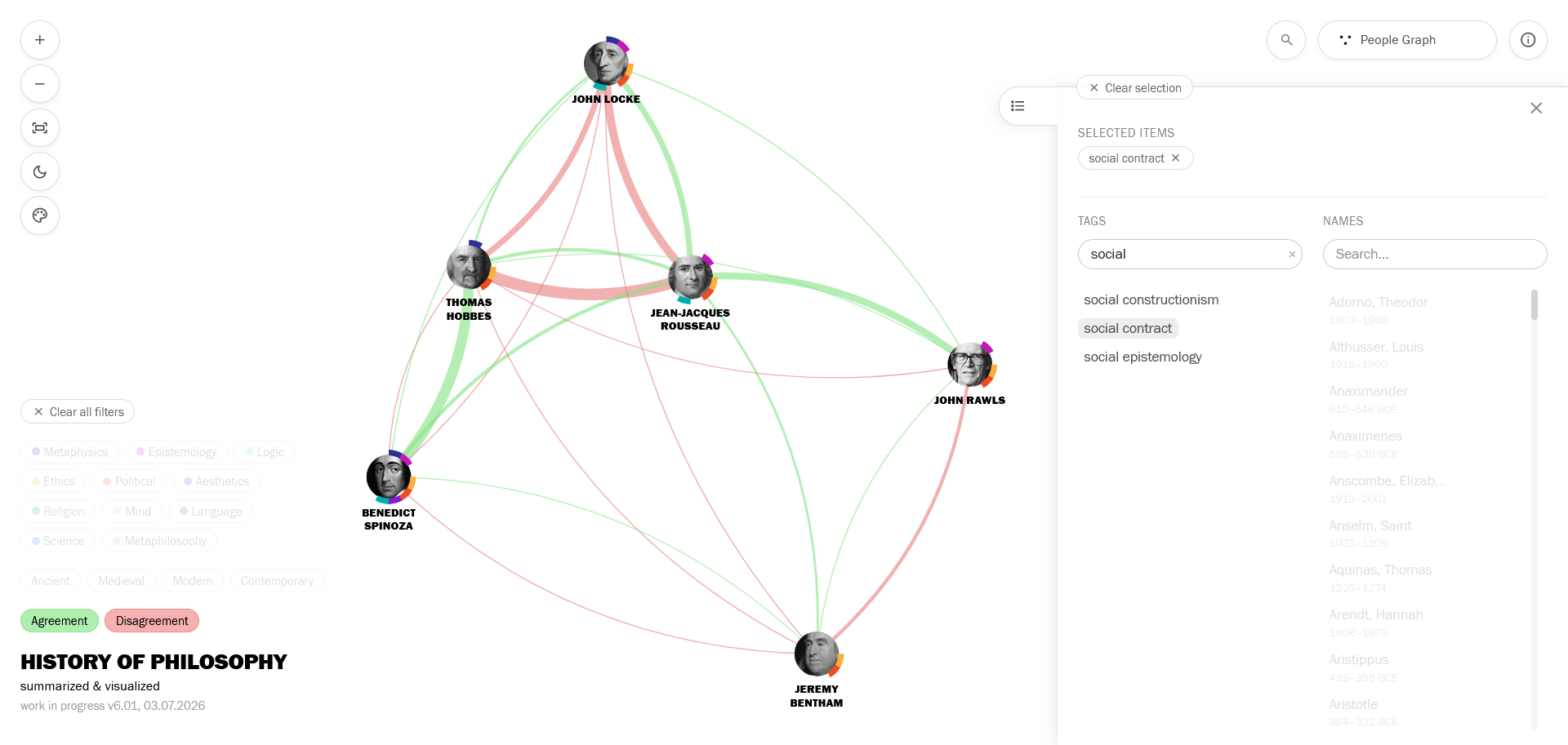
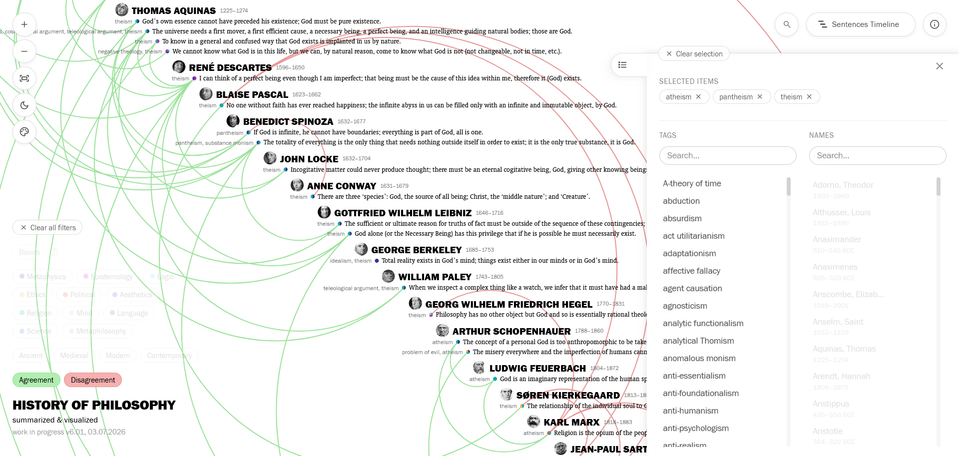
I added a panel where you can filter the visualizations according to the tags, or people. With multiple selections, these can be very useful to see the content around a topic, or the relationships between a specific set of people. Examples:
Social contract
Atheism + pantheism + theism
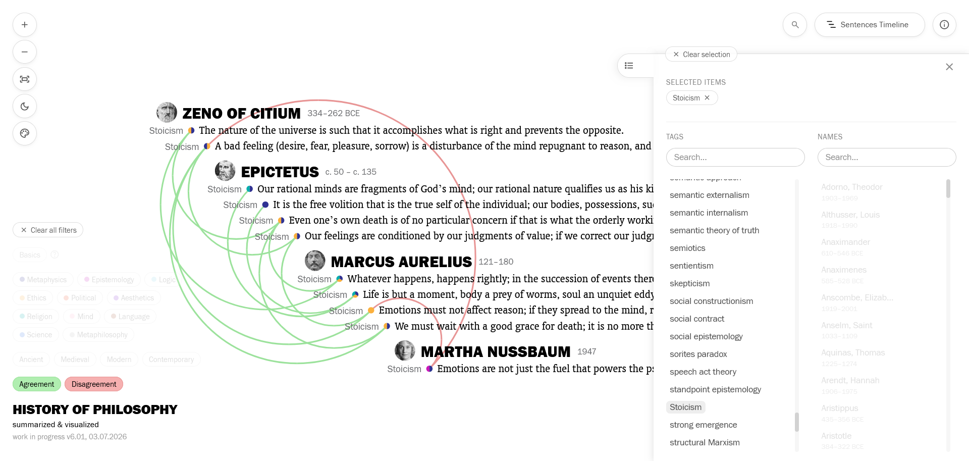
Stoicism
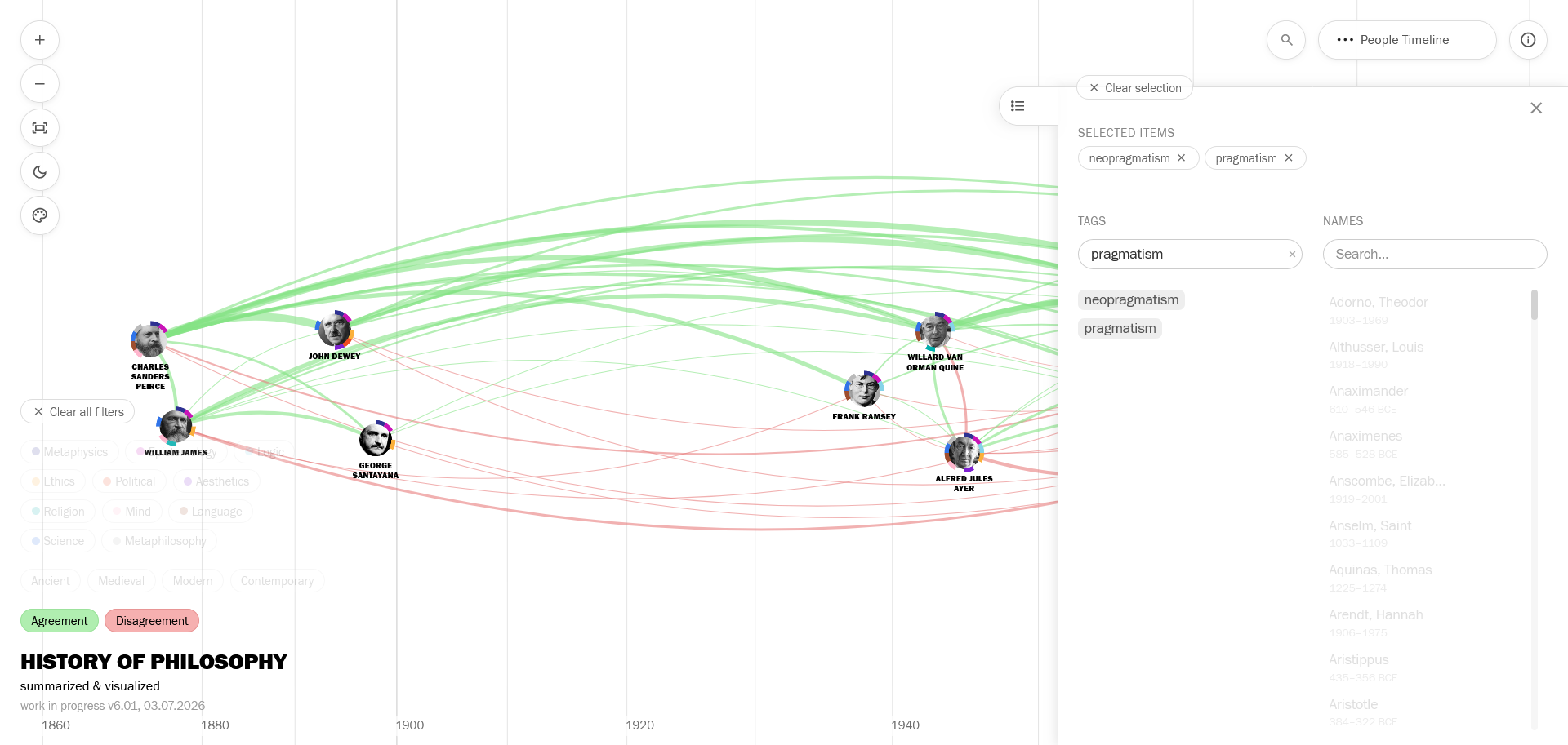
Pragmatism + neopragmatism
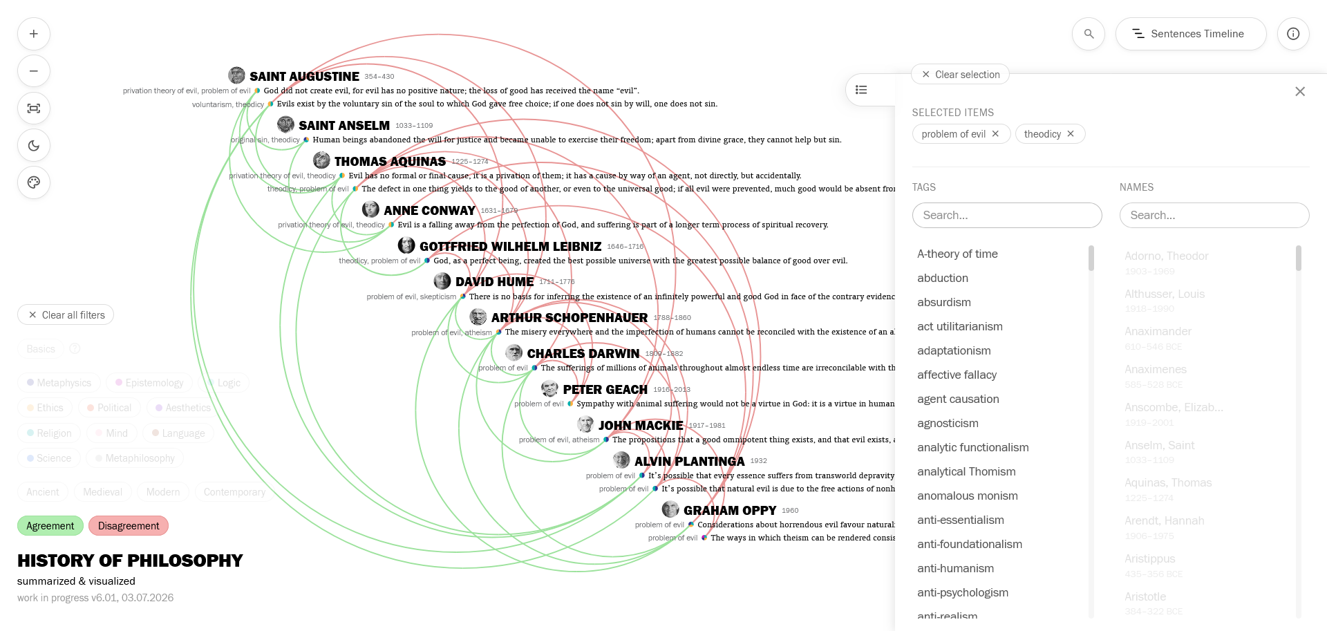
Problem of evil + theodicy
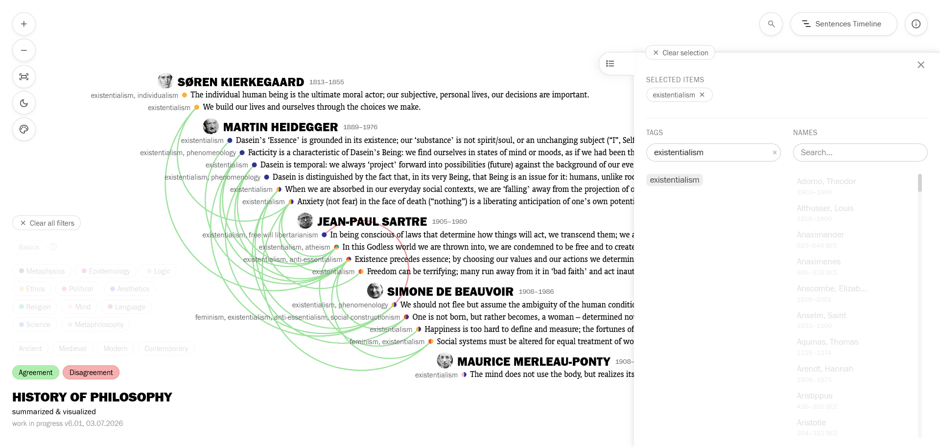
Existentialism
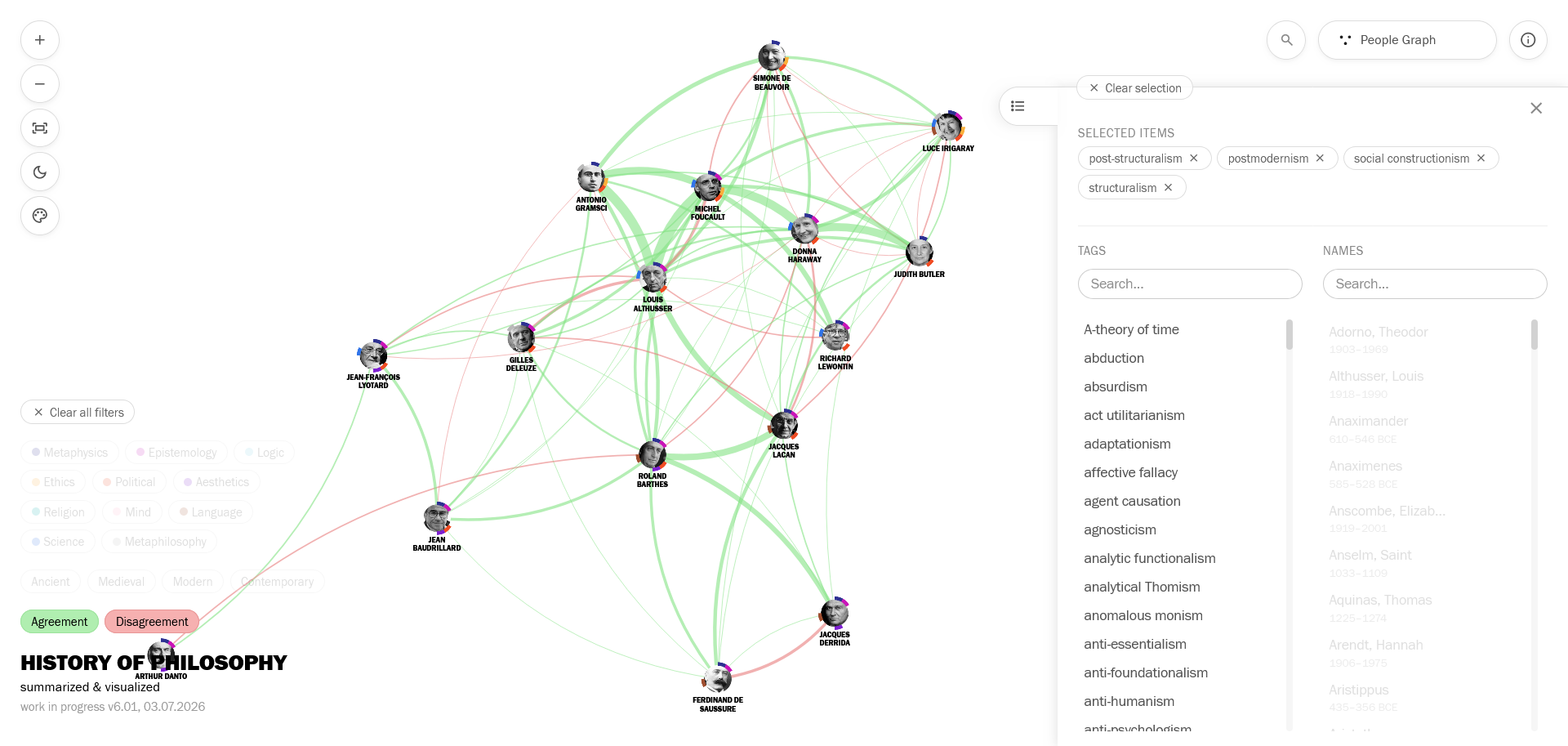
Post-structuralism, postmodernism, social constructionism, structuralism
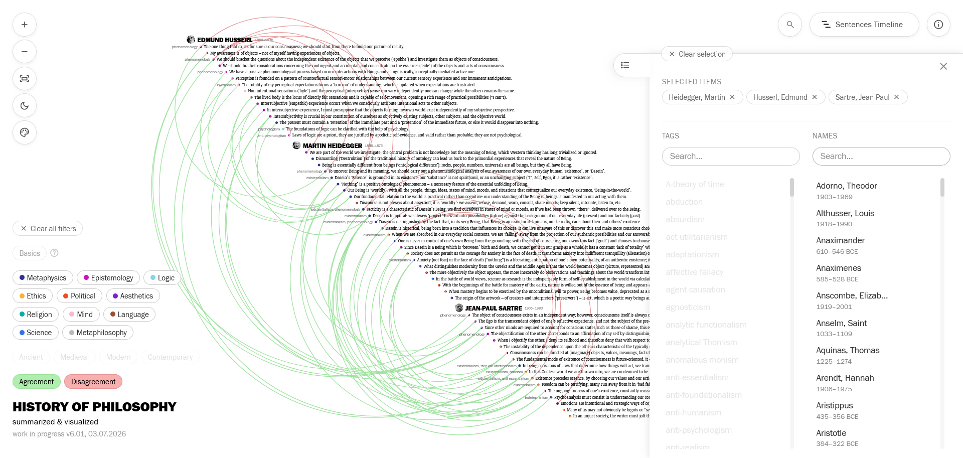
Names filter: Husserl, Heidegger, Sartre
Search Term Filtering
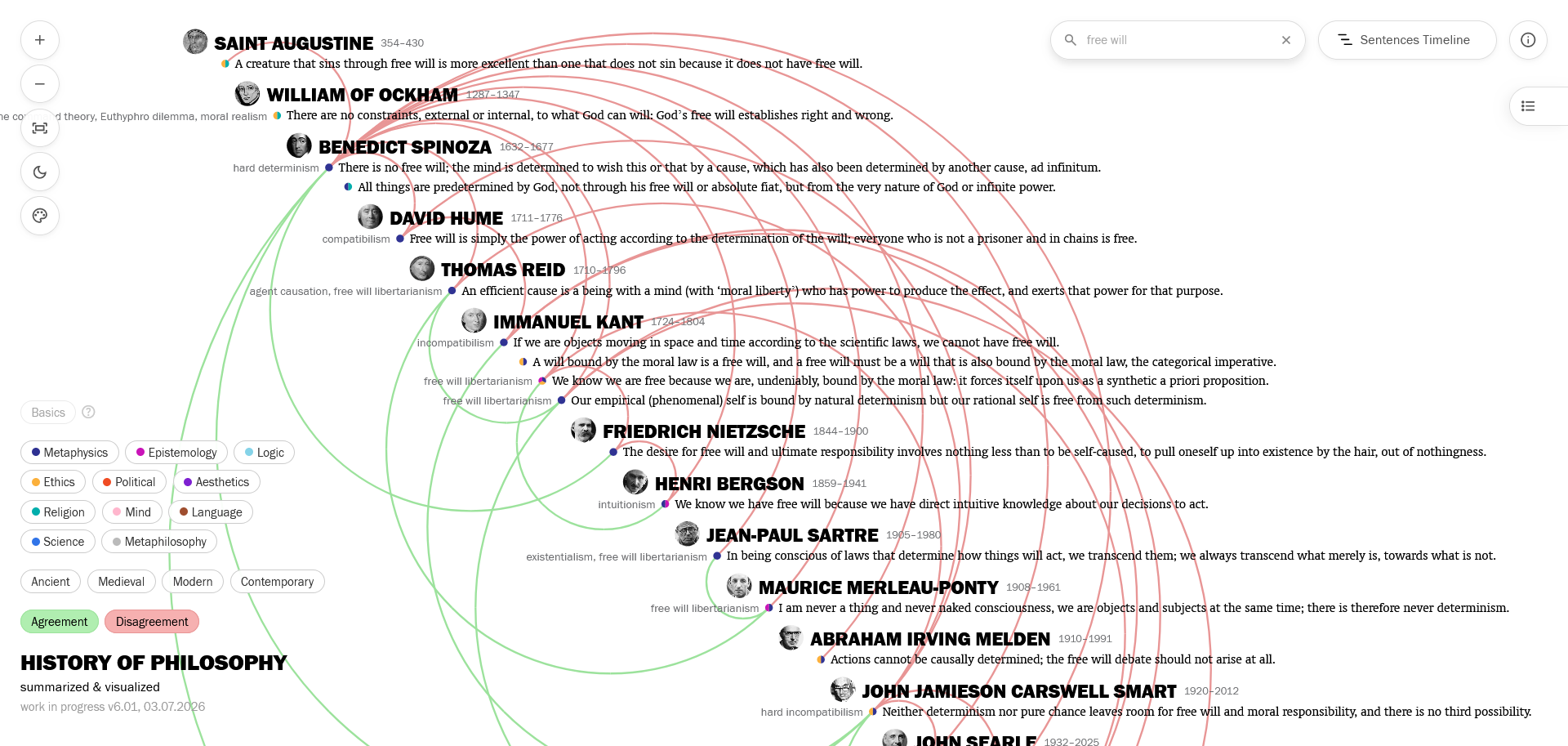
I also added a filtering function to the main search bar: Now, in addition to using the search bar to jump to sentences/people, you can filter the visualization with a search term, e.g. seeing all sentences that contain “free will” in their text or their tags:
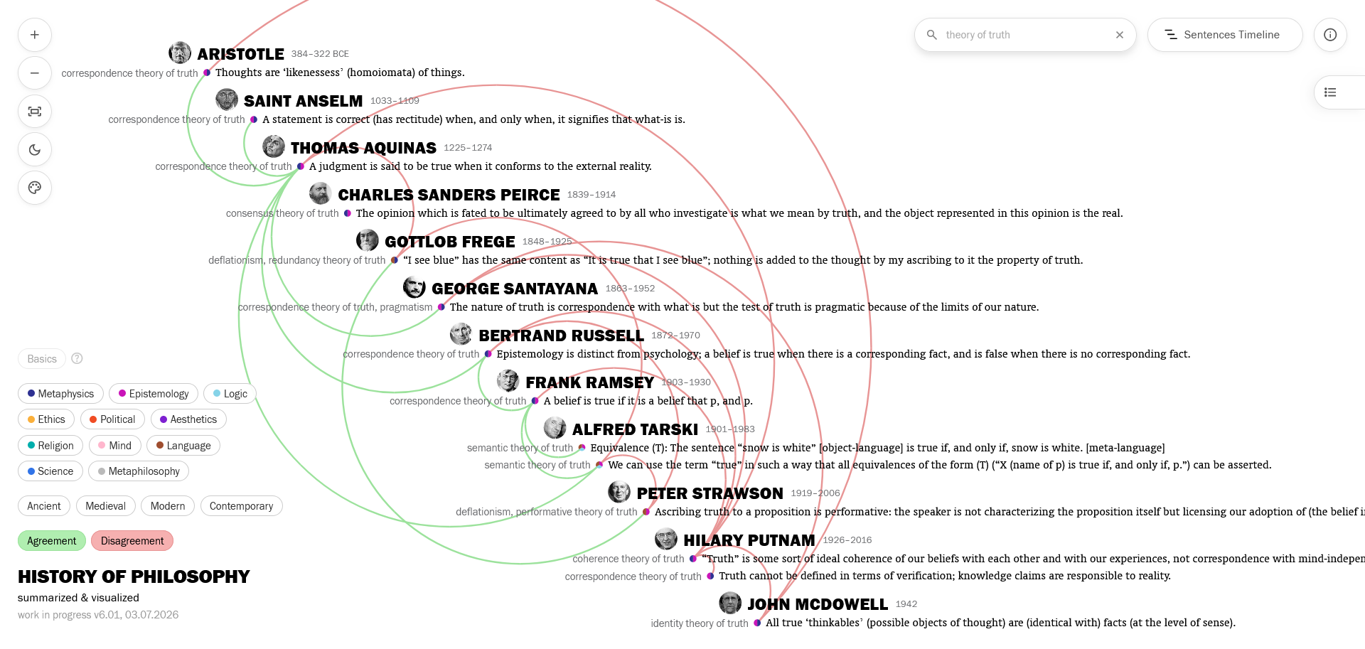
Or search for “theory of truth” to see sentences belonging to various theories of truth favoring correspondence, coherence, performance, identity, deflation, etc. because their tags include “theory of truth”.
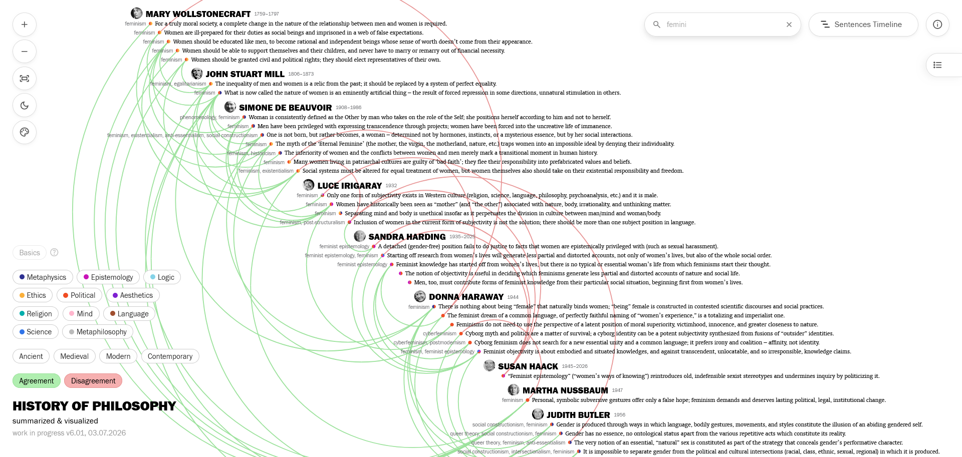
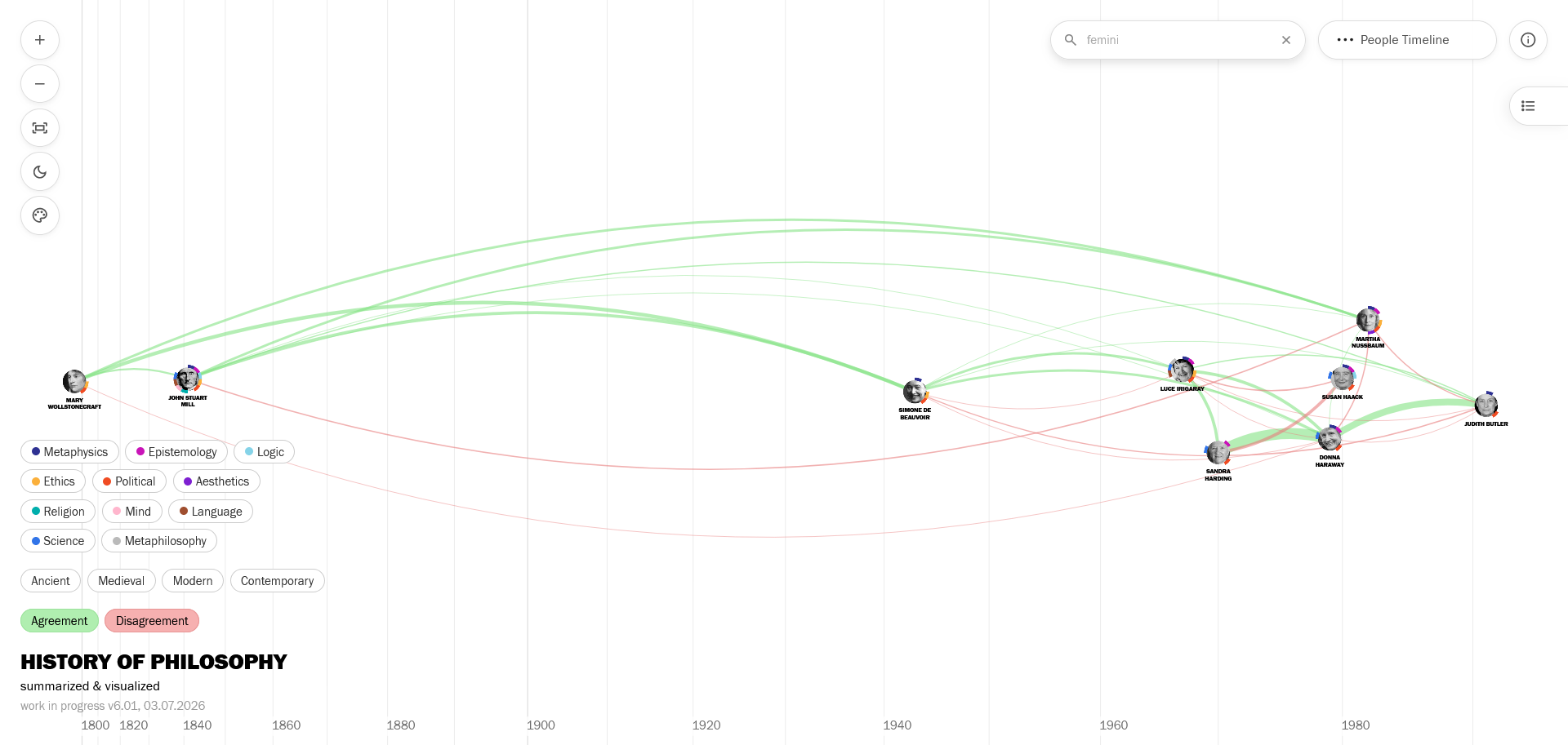
I deliberately didn’t choose a whole-word method here, in order to allow searches like “femini” to fetch content that includes “feminism”, “feminist”, “feminine”, etc.
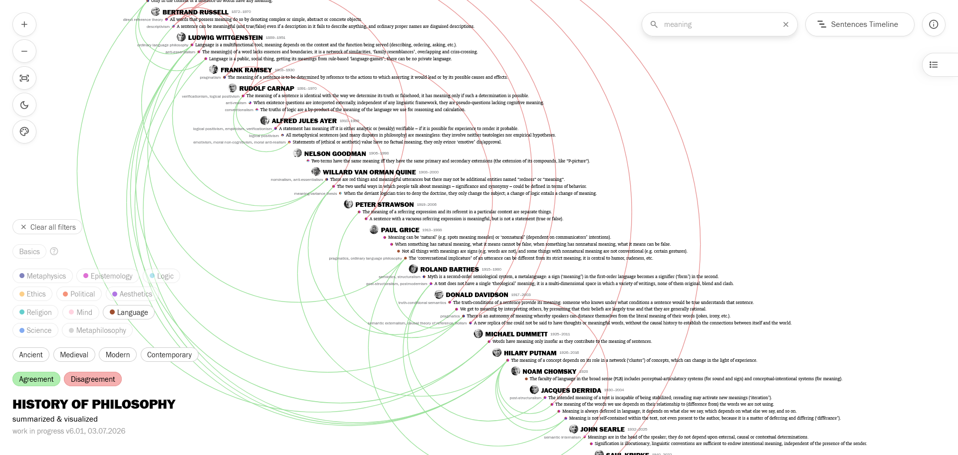
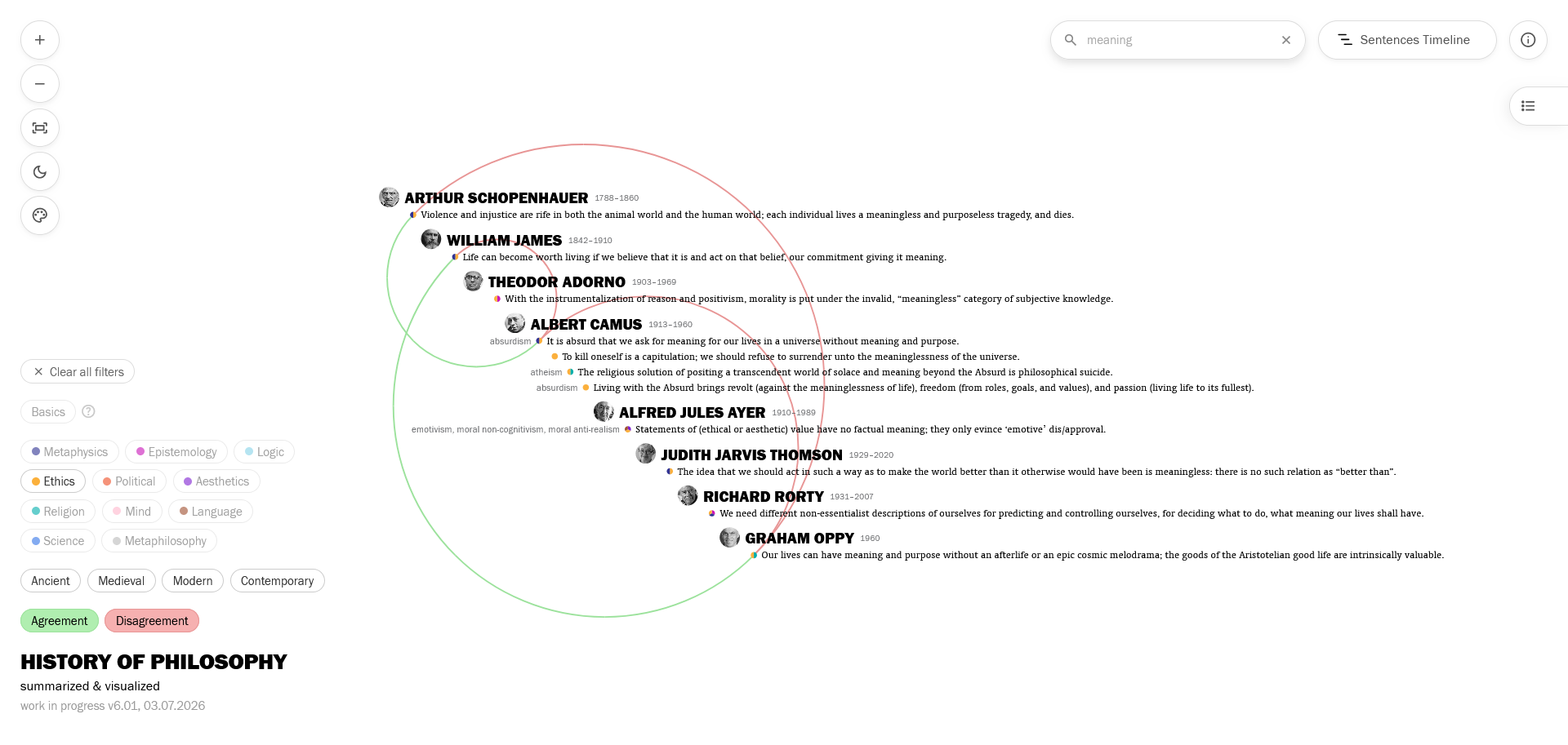
And you can always add other filters to these search filterings: a search filter for “meaning” will show different networks under a Language filter and an Ethics filter.
Other UI and UX improvements
I added a colorblind safe mode toggle for the red-green connection colors, making them red-blue.
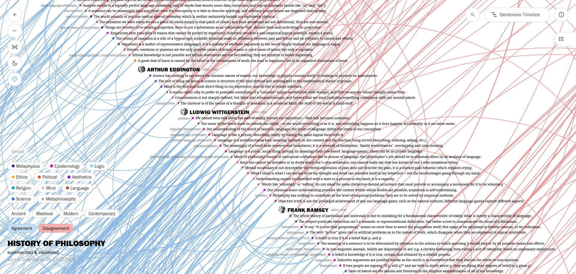
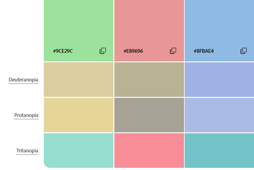
from Adobe’s Color blindness simulator
I added right-click (long tap on mobile) interactions to philosophers for info boxes and to sentences for reference boxes. (The book icons that appear on hover and show the reference are still there as well.)
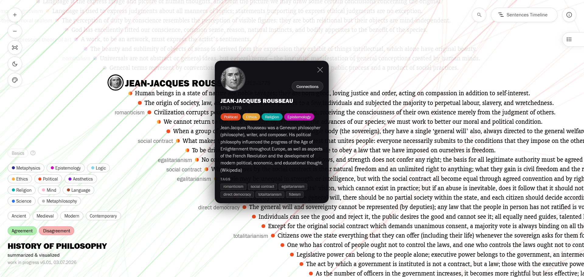
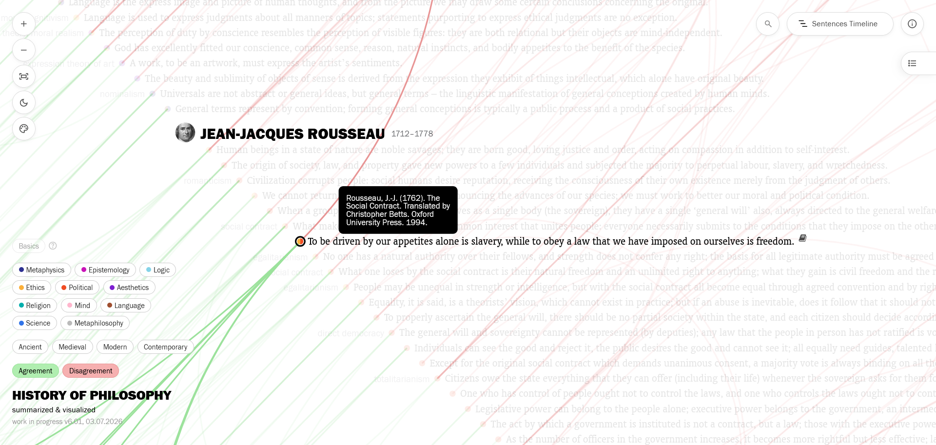
And I was able to increase the resolution of the whole visualization system, so it looks much sharper than before now.
I also tried to make everything work on smartphones too, creating a special menu panel and touch gesture interactions for mobile, though I recommend using this complex system on big screens.
—
This was a lot of work, with many hard information/software architecture decisions, meticulous visual design care, and hours of bug-solving. Hope you enjoy exploring it here.
A final caution note: The editorial limitations which you can read about on the About page apply in these visualizations. Since this is a personal passion project and the research and the editorial work is continuously done by me (without the use of AI), it’s a never-ending work-in-progress; not everybody is here, and the connections/branches/tags of the included philosophers and sentences aren’t exhaustive. You can see and subscribe to the updates here.
I thank my friends Emre Parlak and Korcan Akyıldız for their suggestions and support.