
Redefining Infographics
Do you like infographics? Your answer doesn’t tell much because we’ve been using that word for very different things.
The word “infographics” started its life in the 1960s as a portmanteau for “information graphics”, denoting visualizations of data or information: statistical charts, scientific illustrations, diagrams, etc. According to Google Books Ngram Viewer, “data visualization” and “information visualization” were also terms grouping these products, emerged in those years and being used more frequently (at least in books).
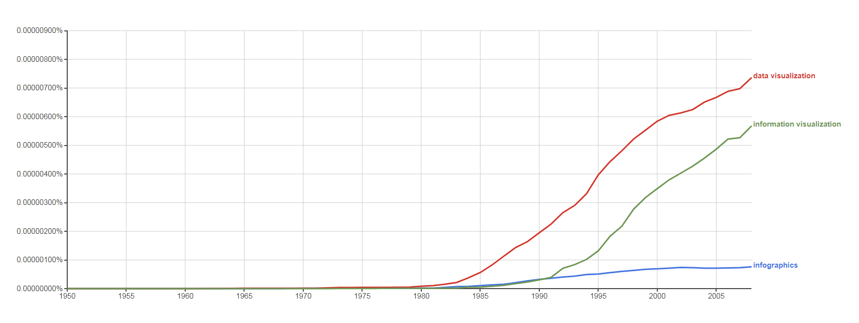
Occurrence (in books in English, 1950–2008) of the terms “data visualization” (red), “information visualization” (green) and “infographics” (blue). (Google Books Ngram Viewer screenshot, 19/11/2017)
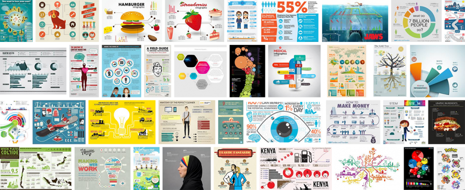
After 2008 (which is the latest date allowed in this Google Books Ngram Viewer interface), something happened. My memory was also telling me that that something happened in those years, but the objective reference I needed for this article was again provided to me by Google: my Google Trends search revealed that just about 2008, a new type of visual product hijacked the word “infographics” as its name within popular culture. I’m talking about the “let’s make people read these sentences by putting cute illustrations, pie charts and huge numbers around” type. Maybe because the word “infographics” is cute and practical enough to resonate with those cute and practical visuals in our minds, the hijacking was so successful that I’ll call this new type, well, “infographics”. (And I won’t use this word for data/information visualization.)
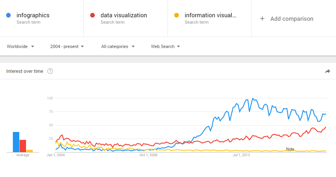
Occurrence (in Google searches, 2004–present) of the terms “data visualization” (red), “information visualization” (yellow) and “infographics” (blue). (Google Trends screenshot, 19/11/2017)
The rise of the infographics and their claim for their name followed a slow and steady trend, as the graphic shows. Some people tried to intervene and proposed new words such as “infoposter” (2011) or “digital poster” (2013) to preserve the original meaning of “infographics”, but to no avail. The problem now is that, even though the word “infographics” is by and large used for those other new things, it still is being used by many for data/information visualization as well, and the chaos prevails. I think it is time we leave that word alone and end the confusion with another method.
Infographics are very different from data/information visualization¹ (dataviz/infoviz) products. They do not engage with rich amounts of data or information using appropriate statistical visualization methods or custom information architectures. Instead of studying a specific problem/question in detail, they tend to scatter bits of found information from a wider subject area. They use color and illustration mostly for decoration instead of function. (Contrast with an anatomy textbook, a case of information visualization, where illustration and colors are not there to support the communication – they are the communication.) Their favorite method of engaging with numbers is to display them in huge point sizes to catch the readers’ interest and to make it feel important.² They love pie charts – an inefficient way to show data but it adds a technical-yet-cool feeling. (See a parody by Phil Gyford.)
These classic features of infographics are not definitive – there exist many types of them, and some that include elements of dataviz/infoviz. Looking at examples with a critical eye would help grasp the difference between infographics and data/information visualization. Infographics usually look more inviting than data/information visualization at first sight, and that is their main purpose. After they get you in, they tell what they have to tell with sentences written around those generic illustrations, simple charts, big numbers, etc. which serve as baits to keep your attention throughout an entertaining reading experience. Remove the visual elements, and you don’t lose much information. (By the way, you can buy “infographics elements” from many stock illustration websites – that’s how generic they are.)
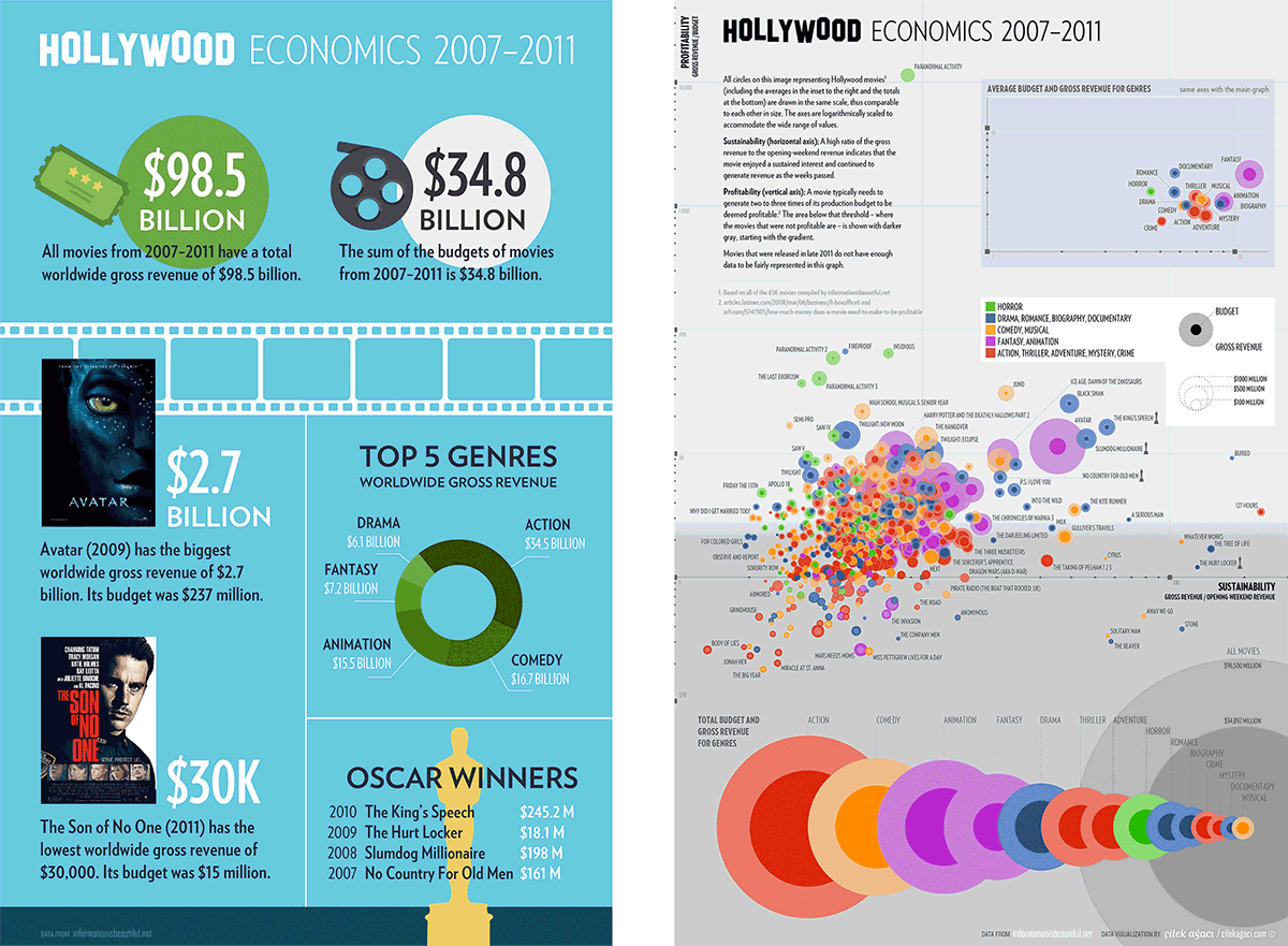
Is it infographics, or is it a data/information visualization? The litmus test I invented works like this: You imagine removing all the visual elements and structures (and their annotations) except text and check how much information you lose. There would be a meaningful amount of loss in data/information visualizations. (On the right is a data visualization we created in 2012. An infographic I created on the same subject for this article is on the left.)
Data/information visualizations, on the other hand, are tools to explore data or learn complex information directly through custom visual elements. You lose all of the information – or a big chunk of it if there is some explanatory text around – if you remove the visual elements. (Think of the anatomy textbook.) Information visualizations depict complex entities/ideas/processes with visual structures, directly (figuratively) or indirectly (diagrams, etc.). Data visualizations use properties (size, position, etc.) of abstract visual elements to represent data sets; this way, they allow us to intuitively understand data sheets with hundreds of rows,³ spot interesting patterns, and generate new knowledge. Color is frequently used for information communication functions such as color-coding for a categorization.
Looking at a data/information visualization is an active process that takes time, where the viewers freely navigate within a visual system and use the visual tools to extract/construct information. Instead of reading one big number about a topic, the viewers get access to a bigger picture where they can compare numbers within various contexts and decide on their positive/negative significance for themselves.² ³ Different viewers can focus on different things and extract different bits of information; the viewers can even draw conclusions that the makers of the visualizations aren’t aware of. Infographics, on the other hand, are like television in this regard; they spell out the chosen messages and numbers one by one to a passive viewer, in a linear fashion – that’s why the tall (vertical) image scrolled down in a blog column is the perfect format for them. You can spend a long time, maybe hours, examining a good dataviz/infoviz, whereas infographics usually are consumed in seconds. For these reasons, data/information visualizations offer a more impartial and cool-headed picture compared to infographics.
Another important difference between infographics and data/information visualizations is that the latter can and often does function as a private thinking tool to analyze and understand one’s own research or data. Infographics has to define itself as a communication tool designed for an audience. Dataviz/infoviz doesn’t need an audience to justify its existence.
Of course, the facts that infographics don’t include as much information as dataviz/infoviz, that they mainly deliver their content as text, that they contain more generic and decorative elements, don’t mean that they are faulty or unnecessary. They are useful in their own ways and goals. People don’t like to read, and infographics make people read a few sentences and get the message across – and make it memorable. (See the xkcd parody.) This too is a design problem indeed; infographics can be seen closer to poster design in this respect. If you need to put out a few paragraphs of information for large audiences, infographics, instead of dataviz/infoviz, may be the right solution for you.
It is for all these reasons that we should be able to tell infographics apart from data/information visualization and clarify our vocabulary, in the interests of information designers as well as lay people. These two types of visual products have different purposes, different formats of content, different communication methods, different production processes, different mindsets. I believe they deserve to have different names. (Note that I’m not saying anything about the subject of the work; you can make a data visualization about a TV show, and an infographic about human genetics.)
When clients want “infographics”, I always ask which one it is; systematic visualizations of rich data/information or colorful tall layouts with sentences and cute illustrations? Because, in my experience, it can be either of them when they say “We want infographics”. (And I am only interested in doing the former.) This is not only a communication problem; sometimes these clients themselves don’t exactly know what they want because they don’t have a distinction between the two in their minds. I’m sure that this lack of categorization has to do with the fact that we use the same word for both. (Imagine a world where we use the same word for editorial design and poster design.) I bet these people would have known what they wanted if infographics had emerged with a unique name of their own. So it’s a bad idea to use the same word for different things for the stages of conceptualization and thinking as well. My plea isn’t just about the words we use, it’s about being able to functionally distinguish the different kinds of disciplines, designers, and products out there.
The word “infographics” may have been created to denote data/information visualization, but it’s too late now: people love infographics and they call them “infographics”. I suggest we leave that cute word in its natural habitat, and use only “data visualization” (“dataviz”) and “information visualization” (“infoviz”) for these types of work. And I suggest we correct people when they use the “wrong” words (both ways – yes, there are people who use “data visualization” for infographics). I believe that, at this stage, using the words we already have (instead of creating new words) looks more promising as a solution, at least in the short term. This is what I’ve been doing for a long time, and it sure had a clarifying effect for people around me, clients included, by properly defining these different families of visual products. I hope you’ll join me.
1. For those who ask: I have a somewhat clear distinction in my mind between data visualization and information visualization: when it visualizes a collection of numerical data (or some other variable) that could be arranged in a table, it’s dataviz (example1, example 2, example 3). When it deals with semantic information that could be expressed with sentences or drawings, I call it infoviz (example1, example2, example 3). Some (example1, example2, example 3) can be hard to put in one category, but they’re definitely not infographics. (I also use “information design” as a general term for the world of dataviz and infoviz.)
2. “It is instinctive to look at a lonely number and misjudge its importance. (…) It is pretty much a journalist’s professional duty to make any given event, fact, or number sound more important than it is. (…) Never, ever leave a number all by itself. Never believe that one number on its own can be meaningful. If you are offered one number, always ask for at least one more. Something to compare it with. Be especially careful about big numbers.” — Hans Rosling, Factfulness, p.128–130
3. The Hollywood Economics dataviz in the litmus test example shows 5 values (budget, gross revenue, profitability, sustainability, genre) for every one of the 656 movies. This means that, even though it’s hard to read the exact numerical values, you’re looking at and extracting information from a total of 3,280 units of data (3,370 if you include the genre graphics at the top and at the bottom). For example: “Action movies mostly fall below the profitability threshold. It’s risky to shoot an action movie.” In contrast, the infographic on the left has 21 units of data, mostly written in plain sentences. One of those is that the action genre has the highest gross revenue. If you look only at this infographic, you may think that shooting an action movie is a great idea, but if you examine the dataviz you become aware that the real reason for that high revenue is the high number of (low-profit) action movies.

Trackbacks.- En Popüler Babalar Günü Hediyesi: Giysi | Baba Olmak