The Art of Insight
Alberto Cairo is an eminent figure in information design, as a practitioner, educator, and author. I’ve always found his influential books in which he promotes a rational, functionalist, content-based approach very close to my thinking and I’ve recommended them to so many people for years – you can imagine how honored I feel to be featured in his latest book, The Art of Insight: How Great Visualization Designers Think.
Although Alberto has eloquently described and exemplified the functionalist method in his previous books, he has always been careful not to dogmatize it and criminalize other ways of approaching visualization, always appreciating that things like beauty, humor, and experimentation also are valuable – even functional. Despite being influenced, like me, by statistics-minded systematizers such as Edward Tufte, he has acknowledged that the Tufte-inspired prescriptivist/idealist discourse focusing on efficiency can lead to a limited, rule-based, exclusivist understanding of visualization. So it comes as no surprise that in The Art of Insight he presents an even more pragmatist and descriptivist/pluralist perspective, exploring the personal stories, goals, and opinions of a diverse selection of visualization creators coming from (or traveling into) different fields such as data art, data science, or data journalism.
Each chapter is structured around an interview with a designer or team featuring a few of their favorite projects and dealing with different themes about visualization – he lists some of them as “visualization as a language; the plurality of goals that such language can pursue; its power to not only enlighten an audience, but also its creators; the relevance of community; the tricky balance that all designers negotiate in their own way between conventionality and uniqueness, norm and transgression, tradition and innovation, the impersonal and the authored, the prosaic and the poetic.” Alberto elaborates on the language analogy and the prosaic-poetic dialects in this recent interview by Brian Tarran:
Not all writing can be technical writing. That’s just one of the types of writing that we could use. And conventional, traditional visualization is analogous to technical writing – you want to communicate something effectively, clearly, and therefore you try to create something that doesn’t use too many words, or too many verbal flourishes, you just go directly to the point and try to communicate directly. But that’s not the only way you can use writing. You can write poetry, so why not using data visualization to create visual poetry?
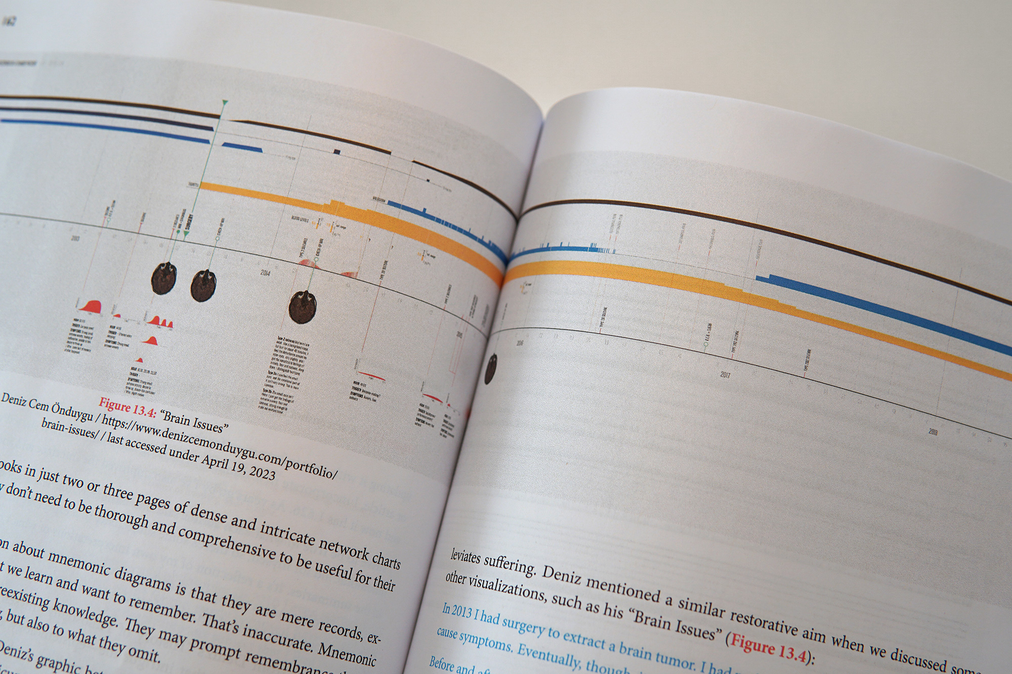
‘Brain Issues’ is an obvious example of the function of visualization “to enlighten its creator” in Alberto’s words. A regularly updated visualization of my medical history, it’s been instrumental in revealing correlations and making medical or lifestyle decisions.
Being a rationalist-minimalist-functionalist designer who’s been working for 15 years and had some teaching experience, I’ve grown to feel the same way both about goals and about methods. There is great value in learning the “rules”, conventions, and the research (on perception, cognition, etc.) aiming at technical, effective, clear communication but once you learn them, you can choose to prioritize them, interpret them, or even ignore them according to the specifics of the project: what you want to achieve, who your audience is, what the medium is, etc. I find Alberto’s distinction in The Art of Insight between the dichotomies of subjective/objective and of arbitrary/deliberate useful.¹ He argues that all of your choices are subjective but that’s okay as long as they’re not arbitrary – as long as you have some thinking, some reasons behind them, and as long as the visualization works with respect to those reasons and goals:
It’s a subjective process: even when working with the same information and pursuing the same purpose, every designer will end up with a different visualization simply because we all have our preferences or styles.
(…)
All reasons I’ve given myself in my inner conversation —or that I’d offer in a conversation with others, should I be part of a team working for a publication or client— can be justified with varying degrees of rigor or informality, from “past research about graphics like this suggests that…” down to “based on my experience, this might work” or “I have the hunch that readers will find it attractive if it’s designed this way.” (…) These reasons could be proven misguided or wrong, but none is arbitrary.
In my experience, as we get older and hopefully wiser, we gradually go from “There is a correct way to do this and I know it!” to “I have my priorities and reasons, other people can have different ones…”, especially about subjects as complex as visualization. This doesn’t mean that we forgo our priorities or reasons, but we become less fanatic about them and more understanding about others, and we don’t anymore expect everybody to be or think like us. We realize we can appreciate other ways of thinking without necessarily adopting them. (By the way, this probably – again, hopefully – is a general pattern of maturation spreading to all aspects of life, not limited to intellectual principles.) My words from the chapter titled ‘The Therapy of Visualization’ featuring our conversation with Alberto could be an illustration of this attitude:
Since I come from a design background, I have a solid sense of the standard distinctions between art and design, decoration and function, etc. And I’ve always felt close to modernism and minimalism ever since I had my first courses on art and design history in university. I respect designers having different theories, styles, or priorities, but I see what I do as visual engineering for analytical thinking. I’m less interested in appeal, impact, or memorability in my personal work, so the evidence that decoration can increase these things doesn’t convince me to use it, for example. [This doesn’t mean that I won’t take those aspects into account when necessary, in collaborative or commissioned projects.]
I may be one of the representatives of a technical, analytical minimalism in this book but I increasingly find myself thinking about and trying out other goals and methods, and I’m very glad to be among these amazing, passionate people – categorized as Pragmatists, Eccentrics, Ambassadors, and Narrators – with different perspectives and styles. The Art of Insight is not only a showcase for the diversity of what visualization can be and do, but also a joyful demonstration of how much we share in common in our stories, struggles, motivations, hopes, or doubts, even when the purposes and the end-products of our work are different.